Your e-commerce store may exist online, but the brand behind your products lives in the minds of your customers. Their interaction with you, your online storefront and your products is what determines whether or not they click ‘add to cart’.
Successful e-commerce brand examples are ones that not only look amazing online, but also shine on printed materials, packaging, products, and more. While these may seem like minor details, they make all the difference when it comes to brand recognition and trust. Getting those touchpoints right for your e-commerce brand also contributes to brand loyalty, so you’re getting customers on repeat, not just once.
So, if you are looking to create a successful brand for your online store, take a look at a few of my top tips for what to keep in mind when creating it as well as some e-commerce brand examples.
What to Keep in Mind When Creating the Brand
You will need a full logo suite
While a full logo suite is important for any business, it is definitely something that you don’t want to skip out on as an online store. The main reason behind this is that you are most likely going to be using your brand in countless different ways.
Take your primary logo, for example. If you have a long horizontal logo, it may work well in the navigation bar on your website, but it may not fit well on the tags you put on the products you sell.
Or, if you have a stacked logo, that may work great on a clothing tag, but it may not fit on smaller branded items.
Each logo and brand mark is going to have its own individual purpose and you would be surprised how often you need different marks as you expand your business and your product line.
Even something like a branded pattern can really elevate your brand experience and your packaging. These patterns can be used to create custom tissue paper to wrap your products or even custom boxes to ship them.
This allows you to create a more cohesive brand experience making sure every touch point a customer has with you is thoughtfully and intentionally branded.
And this is exactly what I tell potential clients when they say ‘I only need a logo right now.’ You actually need a full mark suite and a brand to back it up for success.
Your fonts need to be intentional
You also want to make sure your fonts are selected intentionally. There are a few different reasons why this is important. First, you want to make sure your fonts are legible. While they may look great on your website when they are larger, you want to ensure that they look just as nice on smaller printed materials.
For example, some script fonts may work well on websites when they are larger, however, printed on something like a product box or clothing tag, it may end up being too difficult to read clearly.
TIP: This is where ordering text products or seeing mockups can really come in handy. This allows you to check out your brand in action before launching it across the board or purchasing inventory only to find out you need to change it.
Second, you also want to make sure the font matches the vibe of your brand. While you personally may like a font style, it needs to blend with the rest of your visual elements. And no, this doesn’t mean using your logo font throughout your brand, in fact that font shouldn’t be found anywhere other than your logo itself to maintain the uniqueness of the mark.
For example, when you think of athletic brands like Nike, Adidas, and Under Armour you think of the thick san serif fonts. The fonts are similar to their main logos, and flow with it, but not identical. If they used a serif font like the one Louis Vouilton uses, it would feel out of place with the overall brand and not create a cohesive brand presence.
Lastly, if you are going to use the font on any printed materials, you want to make sure you are even able to legally use the font. This will normally mean purchasing a specific license for the font or using an open source font safe for commercial use. While this may seem like a small detail, it is definitely something to keep in mind!
You should check with any manufacturers before finalizing your design
Finally, you want to make sure that you are checking in with manufacturers before finalizing any design. This is especially important if you are going to get your brand logo, marks, or patterns printed onto any materials you are selling.
Again, you don’t want to launch your new design and put it out into the world, only to find out you have to change it because you are not able to print it successfully onto your products.
This is also another reason why it is so important to have a full logo suite. While one logo or mark may be too large or small for a certain product, another one may work perfectly. This allows you to be more flexible and create more branded products for your business!
E-Commerce Brand Examples
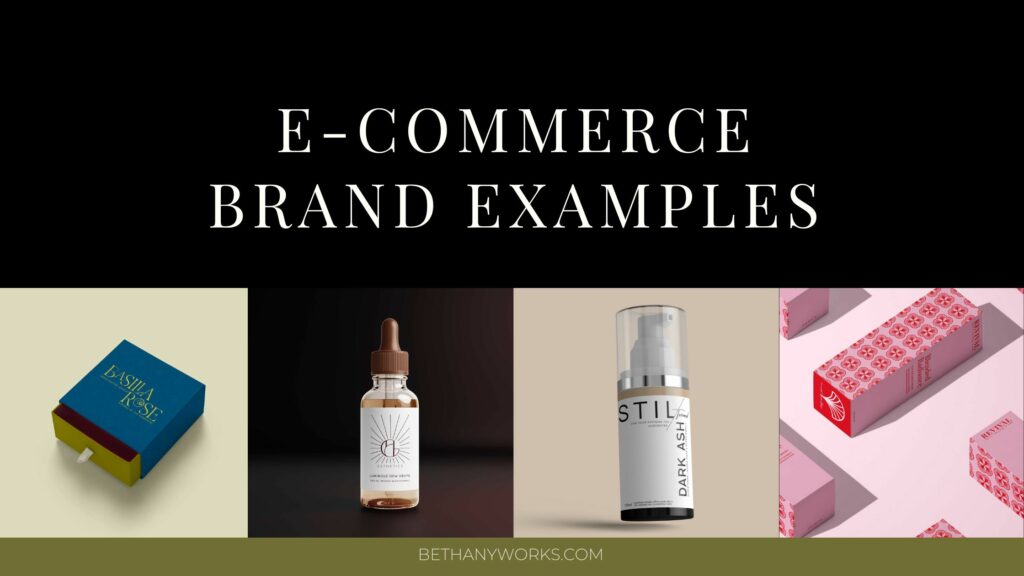
Revival Beauty Tools
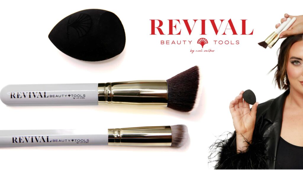
Revival Beauty Tools is an e-commerce shop that specializes in creating beauty tools to help you feel more confident. We built out a full brand for this business and not only built it to be a beautiful online brand, but also one that could be printed onto the products.
Two of the brand visuals are used on the actual products (the brushes and the sponge) and we made sure to create them in a way that they would not only look amazing, but also work well on the products.
We even chatted with their manufacturer during the brand design process to ensure that the visuals we were creating were going to work well on the brushes. This also meant creating a specific horizontal logo to go along with their stacked primary logo to ensure everything was able to be printed onto the brush handle.
This is a great example of why a full brand suite is important. Not only were we able to use this alternate logo on the brushes, but we were also able to use the brand icon on the sponge.
Being much smaller than any other product, the icon was the perfect choice for this and allowed them to create a branded product without trying to force a larger logo onto it.
Stil Boutique + Beauty

RESULTS THAT SPEAK FOR THEMSELVES
Download our case studies + client experiences to review the impact of our website design and brand strategy services have beyond the stunning deliverables you’ll find in our portfolio.
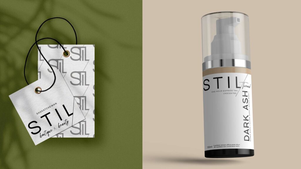
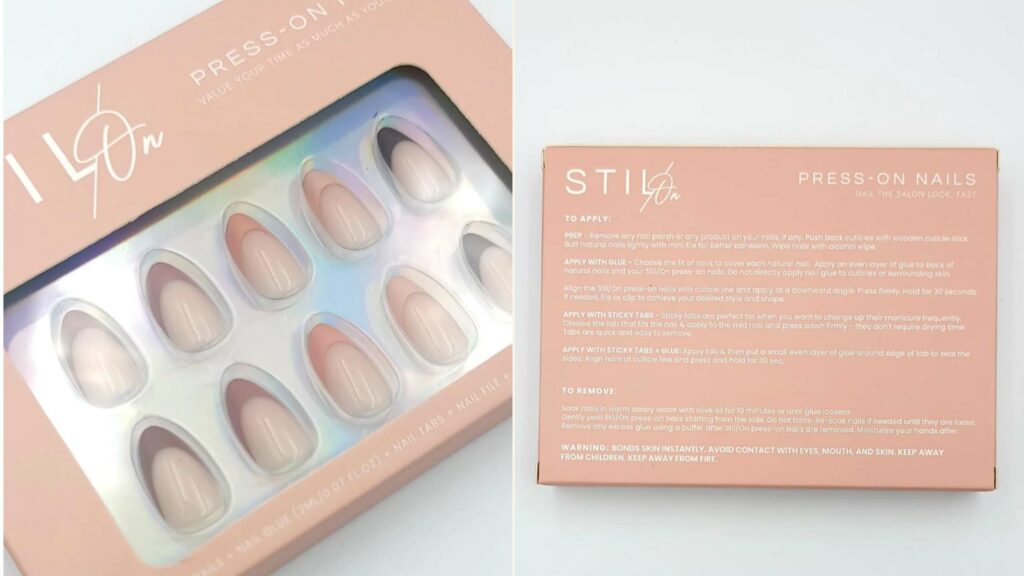
Stil Boutique + Beauty is a boutique brand selling everything from clothing and accessories to beauty products including their own self-tanning line and press on nails. They have a physical location in Canada and sell all of their products online as well.
Not only did we work on their main brand visuals, but we also helped them build out the packaging for their tanning products and press on nails packaging.
This is a great example of why your font suite plays such an important role in your brand. While it may look amazing on your website, you want to make sure when it is printed out on smaller product packaging everything is still legible.
We worked with them to create the branded packaging and labels that not only matched the visual style of the brand, but also clearly communicated all of the important information the customers needed to know when looking at and purchasing the products.
SALT – the label
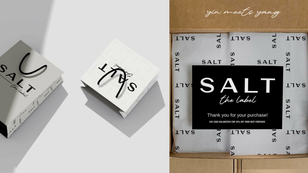
SALT – the label is an athleisure brand and focuses on the balance between comfort and style. Being a clothing brand, we wanted to keep in mind the physical branded materials that they may need and create brand visuals that would seamlessly work for those.
The different logo variations we created for them give them the flexibility to use them on clothing tags, where they need a more horizontal logo, and other materials like bags, where a larger, stacked logo would work better.
Our goal was to give them a brand suite that gave them plenty of options to allow them to create a variety of different materials to use throughout their shop. The brand patterns we created are also the perfect branded touch for tissue paper inside of shipping boxes to again add that extra touch to the customer experience.
FED by Alex
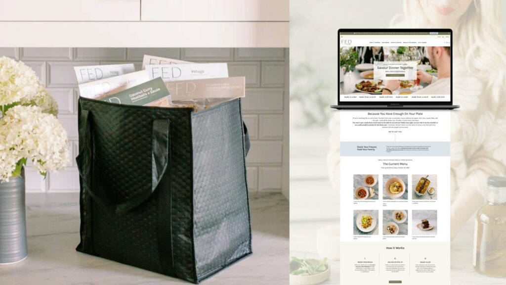
FED by Alex is a home cooked, meal prep service that serves up new dishes every other week. Not only did we do the brand visuals for Alex, but we also helped build out all of the packaging for the meals.
There were a few key aspects that we kept in mind as we were creating the brand and the packaging.
First, we knew that we wanted to incorporate color into the packaging. This meant building out a color palette that was very balanced and had plenty of color combinations that were easily legible to allow for a variety in the packaging.
We also create a couple of different types of packaging for her from stickers to fold over tags. This meant having a variety of brand marks and logos that we could use throughout the different styles of packaging to make sure that each tag felt connected to the brand.
We also picked a heading font that was very clear and easy to read. Since this was not only going to be used on the website and social media, but as the main identifier of the meal on the packaging, we wanted to make sure it was able to stand out and be quickly recognized (even in a freezer full of food!).
Final Thoughts on E-Commerce Brand Design
So, as you are working on creating your brand, be sure to keep in mind these tips and e-commerce brand examples so you have a brand that not only looks amazing online, but also works on printed materials and gives you the flexibility to use it however you need to in your business.
If you are still looking for the perfect designer to help bring this vision to life, I’d love to chat. You can click here to learn more about my brand and web design services or click here to get in touch and talk about what your online business needs!

