
Your website is your first impression, and it needs to be good. Your website design and copy should draw the visitor in and clearly explain how you can help them exactly where they are at. After years of designing and redesigning websites, I have noticed a few things that can instantly repel customers and leave a soured first impression. Let’s dive in so you can avoid these turn-offs!
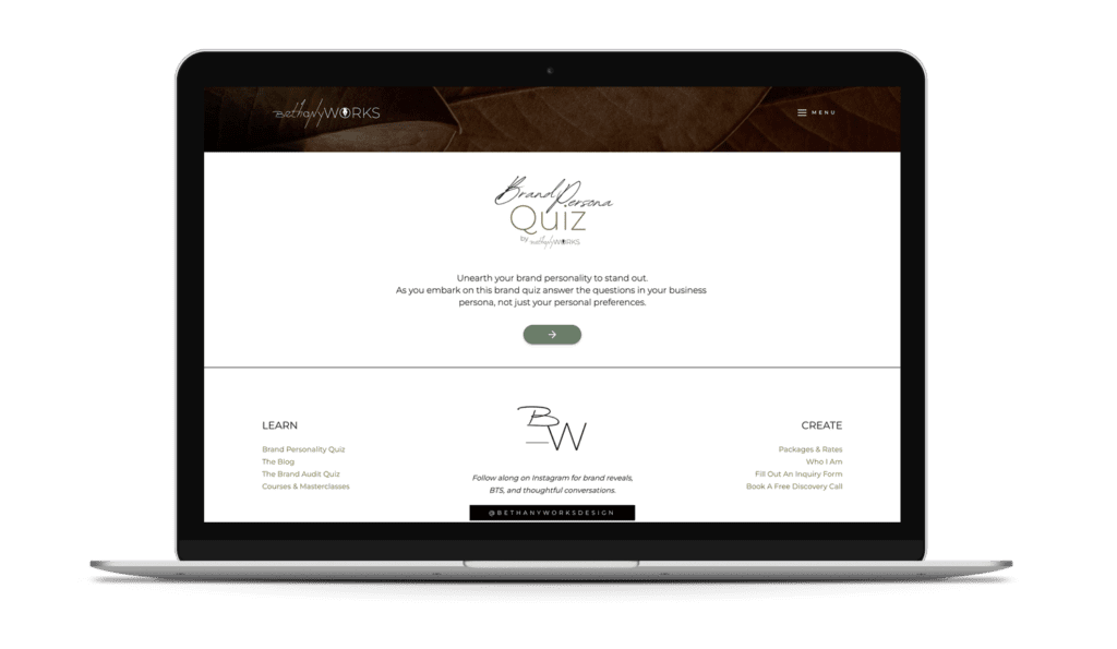
Unearth your brand personality to stand out. Take the FREE Brand Archetype Quiz!
6 Website Design and Copy Mistakes That Repel Customers
1. A Site That Is Not Mobile Friendly
Your site should function on mobile and there is no way around it. For most individuals at least half of all visitors will be coming to the site on their phones, meaning you need to make sure you have a responsive site. If your site doesn’t seem to be compatible with mobile, it might be time for a website redesign, in which case we should chat!
2. Low-Quality Photos
If your site is populated with low-resolution images it is not going to scream ‘professional you want to hire or buy from’. There are several sites, like Unsplash, that offer free stock photos which can quickly solve this problem.
If you’re thinking it is inauthentic for your brand, then find a local photographer and get a solid set of photos you can use everywhere and feel good about. Don’t forget to have the photographer take the photos in landscape orientation so you can drop them into the background of blocks too.
3. Mismatched Stock Photos
If you go the stock photo route (and there is nothing wrong with that) you want to be sure the photos all flow well together across the site. Having mismatched photos in opposing lighting and mood can throw off the whole site and leave your visitors confused.
Thankfully, there is an easy fix, most stock photo platforms allow you to see the published author of an image. So if you like the photo you can click on their name and see all images they have uploaded. Most stock photos are uploaded as part of a collection and then your images can be consistent across the site.
4. A Site That Is Only There to Sell, Not Solve
Your messaging is a crucial part of your brand, and it’s important that you position yourself as the person there to guide or assist your customer. You’re on the sidelines and they are the hero. That means your messaging and site need to be about a solution, a story, a way to complete their journey and get to their ideal selves.
It’s always about them, not you or your product.
5. A Confusing Process or Too Many Steps
Visitors do not read every line of your website, in fact, studies show most will just skim the site. I know, I wish it didn’t work that way.
But, to combat the skimmers, you need a simple and repeatable process throughout the site that leads them to work with you or make that purchase. The process or steps should never be more than 5 and ideally 3.
6. Bad Grammar
Even if visitors are skimming, they are still reading (even if in segments). Your grammar should be spot on and easy to understand. If it helps, write your copy in a doc and use a service like Grammarly to check the copy prior to having it on the site. This will ensure no spelling mistakes or bad grammar.
Feeling Like You Might Need a Website Redesign?
I would love to help you create a stand-out website that leaves the best first impression on your visitors. Tell me about your project today.