As copywriters, You use words to help people connect with their clients and customers and show the transformation that their products and services can give them. But what about your own brand?
While you can write your converting copy with ease, there is so much more to branding for copywriters than just the words. Just like any other service provider, a strategic brand is crucial for a successful business.
Let’s take a look at why branding for copywriters is important and what it can look like!
Why Branding for Copywriters is so Important
First, let’s talk about why branding for copywriters is actually important. Yes, your words matter. People are going to connect with you and hire you because of your words and your writing, but you also have to consider how they are going to find you and what their first impression is going to be of.
When people find your business, their first impression is most likely going to be of your photos, colors, typography, logos, and overall feel before they even read a single word. You want to make sure that your visual brand is just as strong and eye-catching as your copywriting is. The last thing you want is for someone to not even click on your social media or visit your website because of your branding.
Professional branding (that actually includes strategy because otherwise, it’s something that just looks good but doesn’t work for you) will also help you work through things like:
- who your ideal client is
- what words or phrases to use throughout your brand
- how you can best connect with your audience.
All of this is not only crucial when it comes to writing your own copy (and I’m sure you ask for some of the same information from your clients before you write their copy), but it will also help you build a more strategic brand that will attract your ideal clients.
Your visual brand is a great way to represent the style of your writing. For example, do you specialize in personality-driven copywriting? Are most of your clients corporate businesses who are looking for more professional and straightforward copy?
If you are someone who likes working with business owners who value personality, your visual brand can be more fun, colorful, and showcase your own brand personality. However, if your ideal clients are more corporate businesses, you may want your brand visuals to be clean and crisp.
One thing is for certain, regardless of who your ideal client is and what they are looking for, your brand does NOT need to be boring. Let’s take a look at some examples of branding for copywriters that are strategic and aesthetic.
Strategic Examples of Branding for Copywriters
Meg Kendall Copywriting
The business
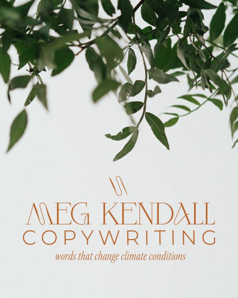
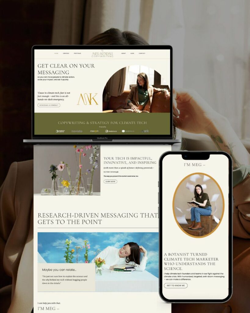
Meg Kendall Copywriting, founded and run by Meg Kendall, is a copywriting business that specializes in curating copy for biotech companies that are dedicated to changing the world.
The mission
Meg Kendall Copywriting works to combine the art of effective communication with the science and technology behind the businesses working to make a difference.
With a background as a botanist, Meg has a signature approach where she takes time to research and curate a message that inspires change and action. She is able to do this with fluidity and creates a final product that is backed by strategy instead of just throwing something at the wall and hoping that it sticks.
The promise
Meg is committed to providing copy that is solutions-oriented, straightforward, and personable that can work for multiple facets of your business like your website, emails, articles, and business-to-business communications.
She works to make the issue of climate change understandable and more approachable to people through tangible facts. Her words can help change how people think and act to create a better world.
How we brought the brand to life
For Meg’s brand, we wanted to create something that was earthy, but also sophisticated and educated. We created a color palette that is full of rich and intense natural colors that are deep but also feel high-end.
For her logo suite, we used a combination of a modified serif font and a classic sans serif font. This helped to create a contrast between her name and “copywriting.” Various line weights were used throughout as well to bring in an artistic feel while also referencing the idea of fusion, creating, and the flow of writing.
Slade Copy House
The business
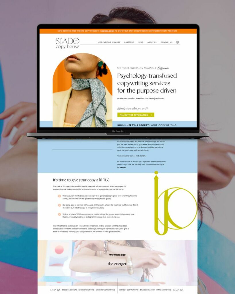
Slade Copy House, founded by Haley Slade, is a psychology-driven copywriting house that provides impactful copy with a little bit of goofiness sprinkled throughout.
The mission
Slade Copy House makes it their mission to empower and uplift their clients, not just through the content they create but also through their supportive client experience. They meet clients wherever they are in their business and as they are and focus on setting clients up for impact and success in their own business.

RESULTS THAT SPEAK FOR THEMSELVES
Download our case studies + client experiences to review the impact of our website design and brand strategy services have beyond the stunning deliverables you’ll find in our portfolio.
The promise
Slade Copy House uses a fun, but serious-about-results approach with their clients. They help their clients who are movement makers hone in on who they are, what makes their business unique, and how they serve their clients so that they can make a difference in the world.
How we brought the brand to life
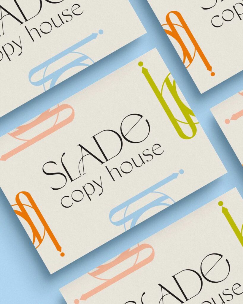
Slade Copy House has a very high energy and uplifting vibe to their copywriting, so we wanted to highlight that throughout the brand. The color palette is filled with energetic and cherry colors, with a few lighter peach tones to evoke a nurturing sense.
Since Slade Copy House and their clients are anything but ordinary, we wanted to create a mark suite that was just as quirky. We customized the word “Slade,” which has a unique combination of capital and lowercase letters to create a welcoming feeling while still being authoritative. We paired that with a clean sans serif for the rest of the logo to create a bit of visual interest while still making it easy to read.
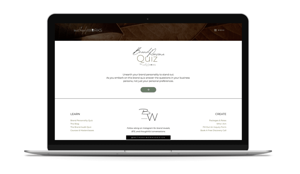
Unearth your brand personality to stand out. Take the FREE Brand Archetype Quiz!
John Egan

The business
John Egan is not just a copywriter, but he is also a content strategist and published author. He is an accomplished writer who has been published in places like Rolling Stones and Forbes.
The mission
John’s goal is to help you feel more prepared and confident with your marketing. Making consistent and profitable content without the skills of a writer can be overwhelming, which, let’s be honest, is the exact opposite of how you should feel in business.
The promise
After working with John, you’ll get strategically crafted content that will help bring you success in a measurable way. In other words, you’ll get content marketing created for you that will actually work to cover your butt.
How we brought the brand to life
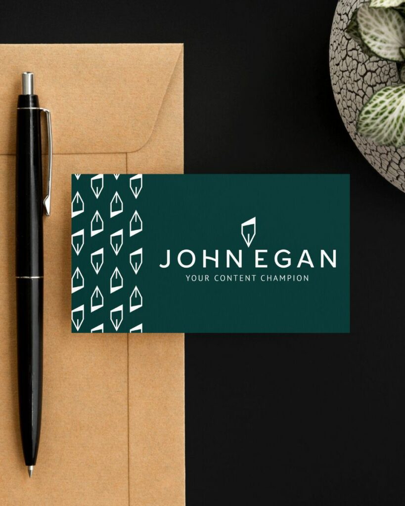
For John’s brand, we wanted to create something that was sophisticated and a bit more traditional while still having unique elements to it. The colors we used throughout the brand were rooted in earth tones that imply a sense of seriousness – which match the equally serious and noted brands he writes for. We used red, blue, and light green as the primary colors to invoke a sense of authority and establishment.
When it came to the font suite, we really tried to hone in on the “no fluff” aspect of the business. We used a classic sans serif font and an icon that has sharp angles to help imply a swift pen, concise works, and the “to the point” style of writing that John specializes in.
To balance out the traditional aspects of the clean fonts used throughout the logos, we added a slight curve in the “H” and “A” to indicate imagination and flow.
The Lively Creative
The business
The Lively Creative is a copywriting agency that creates compelling copy for bold businesses.
The mission
The Lively Creative understands that words mean dollars. They also get that the best approach to collaboration is a friendly and welcoming one. Using their quick and sharp pen, they help elevate businesses and boost their bottom line.
The promise
The most important thing is confidence, and that is what The Lively Creative aims to provide. They help you create crystal clear messaging with copy that you feel great about because it not only sounds good but also connects to and converts your clients effortlessly.
How we brought the brand to life
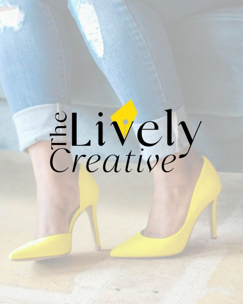
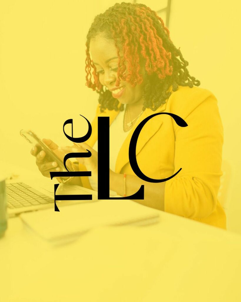
Just as the name suggests, The Lively Creative needed a lively brand. We chose spring season colors like yellow, teal, and bright blue to bring an energetic feel to the branding.
For the mark suite, we wanted to create something that was unique. We used a bold sans-serif font for the logo to make it stand out and make it easy to read. The use of an abstract quill pen in the logo adds a custom touch to the logo while also speaking to the innovative approach that they take when it comes to their copywriting.
With all the effort you put into creating words that are going to connect, the last thing you want is for your business to get lost in the crowd because of an ineffective brand. Branding for copywriters can be just as important as the words you create and is a crucial step to your business that you can’t skip out on. Ready to take the leap and build a strategic brand that is going to work for you, not against you? Get in touch to see how we create that for you!

