Color is used for brands all over the world, and the colors that represent their brand serve a purpose. Taking the time to choose your brand color palette based on color psychology will help you solidify your brand identity.
What Is The Psychology Of Color?
The Psychology of Color breaks down the symbolism that each color carries and explains the impact of different colors that are around us every single day. When we see certain colors, our brain instantly reacts to those colors, most of the time subconsciously and without even realizing it.
The Psychology of Color is more specifically the study of how we as humans behave when it comes to certain colors. Understanding and realizing what each color represents in our world will help you decide what colors will be perfect for your brand color palette.
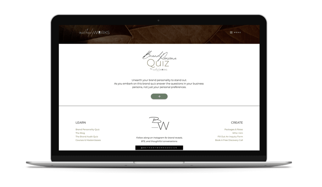
Unearth your brand personality to stand out. Take the FREE Brand Archetype Quiz!
Your Guide to Color Psychology – The Basics
The colors we see throughout the day evoke different emotions and make us behave and feel a certain way. Every color has a certain purpose in your brand color palette and companies all over the world have chosen their colors based solely on the Psychology of color.
If you’re still wondering “Is color psychology real?”, take some time to think through some of the examples listed under each color below and think about the emotions that come to mind when you see each business.
As you review the list, the focus will be on the positive psychological effects of color on human behavior that each of these colors can bring on. Negative emotions like anger, sadness, and danger are not often an emotion that companies or businesses want to elicit, so these are left out.


Red -Power, Passion, Excitement
The color red can be seen everywhere as you drive down the road. Businesses that serve food or want a quick response use red as one of their brand colors to evoke that exact quick response and grab your attention.
Red is an incredibly powerful color and captures the eye quickly and effectively. Many companies use red to provoke excitement and even encourage someone’s appetite. Wendys, Chick Fil A, Sonic, McDonalds, and more use red in their logo to produce excitement as well as make someone think they are hungry.
If you want to use red in your brand color, you must know that it tends to overpower other colors because it is so stimulating. Often it is paired with neutrals, yellows, or other shades of red in branding.


Yellow -Happiness, Positivity, Creativity
The color yellow represents happiness and evokes customers to associate the company that uses yellow with positive energy.
When it comes to yellow color psychology, it is a great color to use if you want to bring positivity and optimism to your website. It can help users relate your page to positive aspects and put them in a good mood.
Yellow is often paired with its complement – blue. However, it is a color that can go well with many others.


Blue- Trustworthiness, Serenity, Dependability
The color blue is used in big-name companies such as Walmart, American Express, Facebook and more. The color blue represents trustworthiness, dependability, and serenity.
Many of these companies chose blue for the sole reason they wanted their brand to portray trust to their customers. Using blue in your brand color palette is a great way to evoke reliability and help customers to relax (and trust your brand).
Blue pairs well with many colors, but is often seen in a monochromatic or analogous color schemes.


Purple- Nobility, Wisdom, Innovation
Purple is a color that portrays wisdom, royalty, and nobility to customers. Using purple as one of your brand colors can also establish an image of vision and wisdom.
There are many companies that use purple as one of their main brand colors such as Yahoo, Cadbury, FedEx, and Hallmark.
Purple has been used for years in different companies’ brand color palette and should be used so wisely. There is a balance when it comes to purple color psychology. Overusing the color purple in your brand identity can go from representing royalty to being perceived as arrogant or childish.

RESULTS THAT SPEAK FOR THEMSELVES
Download our case studies + client experiences to review the impact of our website design and brand strategy services have beyond the stunning deliverables you’ll find in our portfolio.
It pairs well with neutrals and greens.


Green- Harmony, Growth, Renewal
The color green can often represent a focus on nature, but it can also connect to ideas like growth, energy, harmony, and renewal.
Another purpose of the color green is that it represents money so using the color green in different aspects of your company can the idea of wealth.
Green is often used in outdoor brands or brands in the financial sector. Think of companies such as John Deere and Animal Planet who both have green logos and promote growth and nature. Also, Whole Foods has a green logo and the basis of its products is on healthy and natural eating.

What About Neutrals?
Neutrals are important to think about when it comes to color psychology as many brand color pallets will have at least one. They are used to help emphasize the other colors and bring balance. That said, they are not meaningless, and can carry some weight.
Black- Sophistication & Strength
Black is used by many companies and is often included in different companies’ brand identity. Black is a color that typically portrays sophistication and strength.
Many brands use the color black to bring attention to certain aspects of their website as well as portray strength when customers visit their store.
Brown – Down to Earth
Brown is a color that promotes a down to earth mentality and helps build trust with customers. Brown is used as a color to represent relaxation and solidarity.
Brands such as UPS use brown to represent their down to earth and dependability to customers all over the country.
Grey- Balance
Grey is a common color to use to represent balance within your brand colors. Grey is a color that evokes feelings of calm.
The company Apple and Nissan use grey throughout their marketing as well as on their products to represent balance and emphasize another color.
What About the ‘In-Between’ Colors
(i.e. Turquoise, Magenta, etc)
When it comes to in-between colors, each color can evoke certain emotions and responses, but there are too many to list them all here. However, you will want to keep in mind,
- Combining colors can tone down normally harsh or powerful colors
- Using an ‘in-between’ color can create more calm
- These colors can also help your brand be even more targeted towards a specific niche
For example, turquoise is a great color to add to your brand color palette if you want to evoke feelings of tranquility or hope. However, cerulean blue which is just a bit different has the power to promote cleanliness without being too overpowering or sterile.
Magenta is a great example of how you can tone down the powerful nature of red and purple. This color promotes innovation or seduction (it’s all about how you use it and the shade).
Choosing Your Brand Color Palette Will Be One of The Most Important Decisions
Your brand color palette has immense power so taking the time to understand color psychology before choosing your colors as well as basing them on your brand archetype is highly important. Before you buy a logo, create a website, or assemble graphics it is important to create your brand identity for your company.

You can get started with this by taking the brand quiz. This will help you answer questions about your brand to narrow down what colors are recommended based on your archetype.
A brand identity brings the fonts, colors, visuals, and logos together and makes sure they all blend cohesively and uniformly. If you work with me, we have a collaborative process where I guide you in defining your brand and then I create your cohesive brand identity which you can use throughout your platforms.