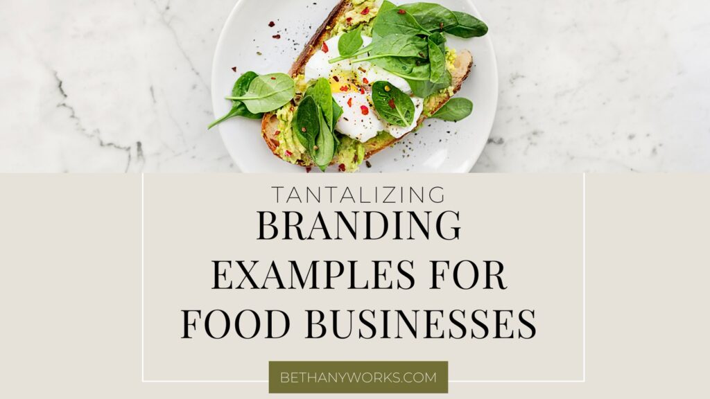
It’s no secret that the food industry is a highly competitive and constantly changing market that requires consistent effort to create an effective brand. Whether you have a local restaurant, sell your products in stores, or have an online shop that ships directly to customers, a strategic brand is crucial to help you stand out from all of the other competition in your market.
When it comes to branding for food businesses, it goes further than just having a logo you can stick on your packaging or put at the top of your menus. Your entire brand presence will affect how people perceive your business, even before they try a bite of your food.
Let’s take a further look at why branding for food businesses is so important and examples of what this looks like in real life.
Unearth your brand personality to stand out. Take the FREE Brand Archetype Quiz!
Why Strategic Branding for Food Businesses is Important
Before we take a look at what a food branding example looks like in action, let’s talk about why an effective brand is essential. When it comes to your business’s branding, the look and feel of your business can be just as important as the product itself.
For example, have you ever gone to the grocery store and seen a product on the shelves and picked it up just because of the packaging? You may not even need whatever it is or have never thought about buying that product before, but because of the branding, it jumped off the shelves at you and you bought it? I know I have done this with wine countless times.
Or, have you ever been walking down the street and seen the front of a restaurant and stopped just because of its fun and eye-catching logo and colors?
These are perfect examples of strategic branding in action. The logos, the colors, the fonts, these are all things that people are going to see and judge your brand on before they even try your products.
It is also important that the colors and fonts that you choose for your brand match the vibe of your ideal customer and the products you are offering. For example, most health food businesses will opt for a more clean and more modern font because that is what their ideal customers are more likely going to be looking for on the shelves.
When it comes to colors, it’s important to think about what types of food you are selling and the overall mood you want to convey with your brand. Do you want it to feel warm and welcoming, or sleek and elegant?
Finally, if you are selling products in a store, it’s important to also consider what flavors you are putting on the shelves and the packaging you use for each. For example, if you are walking down the ice cream aisle in a store and you see a pint of ice cream that is brown, your mind instantly goes to chocolate or coffee. Or if you see one that is red, you might think of berry.
However, if you picked that brown pint up and found out it was blueberry, you’d be very confused and would most likely put it back. While you may not have these specific colors in your general color palette, you can build off of it to create the specific packaging for each of your products.
In this case, it is crucial that you think about the shades of colors you use in your color palette and match the new colors for your packaging to those shades. If your palette is filled with pastel colors, you don’t want to pick a neon color for your packaging. This is going to confuse your customers and can potentially make them question if the product is even part of your brand.
Lastly, product placement within stores is just as important to consider with your food branding as a restaurant or food cart location. Where the product sits on the shelves markets to a specific audience. For example if you sell a healthy but flavorful spaghetti sauce that has ‘hidden veggies’ for kids- you will likely want a lower shelf placement and brighter colors to catch children’s attention.
Branding for Food Businesses in Action
Bethany Works® has served several food businesses over the years and below is a peek into these brands in action.
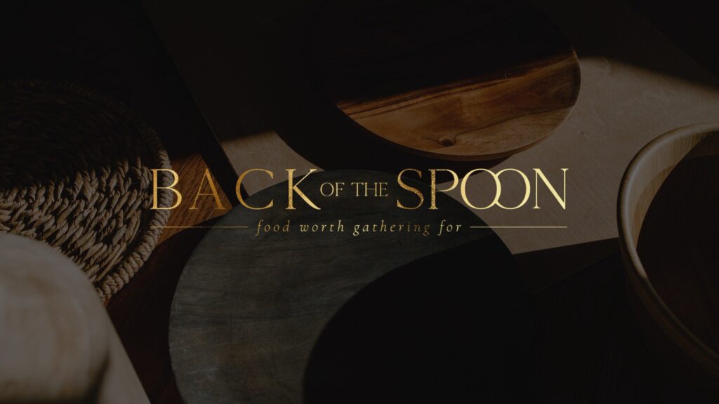
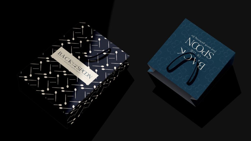
Back of the Spoon
The business
Erin Chromik, CEO and founder at Back of the Spoon specializes in handmade perogies, just like her grandma used to make. She serves these and her signature sauce in person at markets and pop-ups in addition to being on route for retail stores.
The mission
Back of the Spoon’s mission is to create food that is satisfying with each spoonful and brings you closer to your loved ones and your community. This is why we developed the tagline ‘Food Worth Gathering For’ as part of our work together. Less time in the kitchen equals more time to connect, pour a glass of wine, and enjoy some wholesome comfort food.
The promise
Back of the Spoon creates food that is not only comforting but is made with real, simple ingredients. These are the same ingredients that Erin’s grandmother and yours used in the kitchen to make the perfect home-cooked meal.
How we brought the brand to life
For this brand, we created a gourmet and elegant feel while still having a wholesome and home-cooked atmosphere. This branding helps attract the ideal customers they are looking for – ones that are going to make the initial buying decision based on the look and then continue to come back based on the taste.
The logos contained a classic serif font that is clean and modern. We added a custom overlapping ‘O’ element to symbolize unstacking dinner plates as you set the table to gather with friends and family.
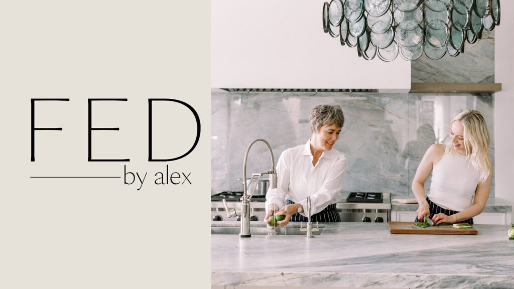
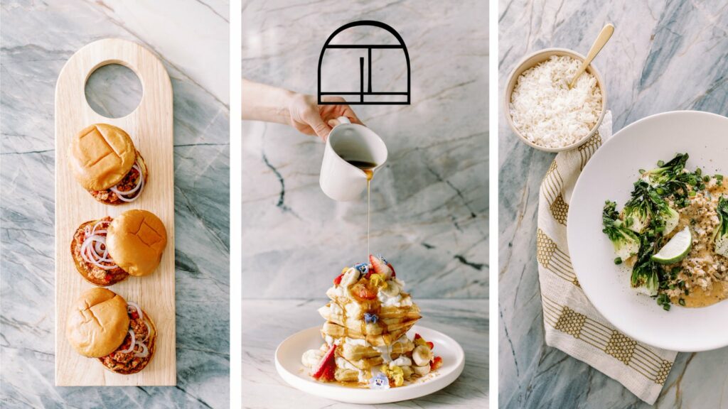
FED By Alex
The business
Located in Calgary Alberta Canada, FED by Alex creates small batch frozen meals made from scratch. They are thoughtfully prepared for families looking to get some time back in their daily lives while still having meals that are more than ‘just alright’. The menu changes every two weeks and she has regular customers who stock their freezer in addition to customers who pick up Chef’s Bundles for sick loved ones or a Meals of Mamas kit for postpartum moms.
The mission

RESULTS THAT SPEAK FOR THEMSELVES
Download our case studies + client experiences to review the impact of our website design and brand strategy services have beyond the stunning deliverables you’ll find in our portfolio.
The mission at FED by Alex is to help renew family mealtime. They help you nurture and nourish your family with homestyle meals that are easy and simple to get on the table. You and your family deserve to be taken care of and well-fed.
The promise
FED by Alex knows that your life is busy and you are constantly bustling. They are here to make your life a bit easier and ensure you can keep up and stay full! Deep and loving bonds are created from across the table – through a little virtue and a little vice, these meals make that possible.
How we brought the brand to life
The overall mood of FED by Alex is modern and sophisticated while also caring. We used light blue to create a calm feeling while also building trust. The green brings in a sense of growth and wealth, while the blush color ties it together by bringing in a bit of warmth (and nurturing feel)
For the logos, we used a modern sans serif font that is all uppercase. We paired that with an approachable and feminine font in lowercase to help create a bit of contrast and help balance out the mark. The arched icon we created uses all of the letters in ‘FED’ in different directions to create a modern and unique mark for the brand
Rosemere Tavern
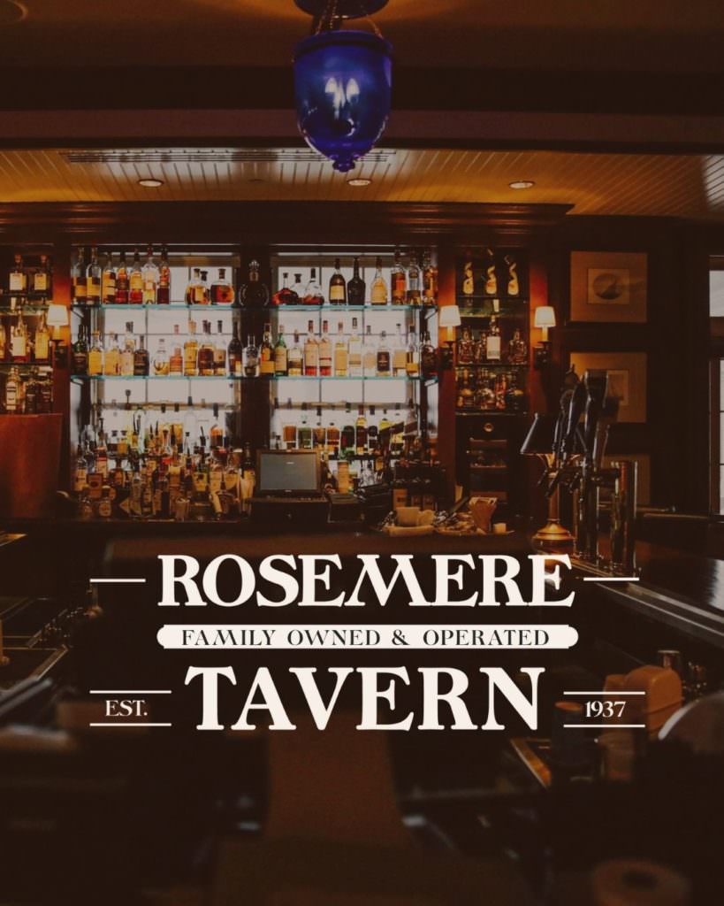
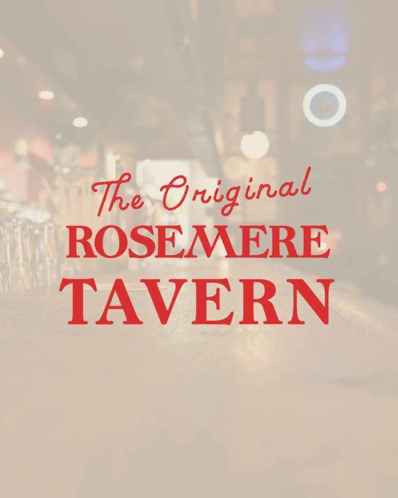
The business
Rosemere Tavern is a local, family-owned tavern that has a variety of beers and wines in addition to punch cards and other games. This tavern is rooted in history, established in 1937, and passed down for generations. It needed to feel like nostalgic old Americana. The mission
Being a family-owned business, Rosemere Tavern aims to create a space that is fun and welcoming for all. Whether you are looking for the perfect microbrew or a relaxing glass of wine after a long day, the Rosemere Tavern has what you are looking for. After all, ‘Your Friend and Family Are Already Here’.
The promise
Rosemere Tavern is somewhere you are always going to be welcome. Whether you are looking for the perfect spot to hang out with friends, or somewhere to pull up a chair and talk about the good old days, there will be a seat for you here.
How we brought the brand to life
For Rosemere Tavern, we really wanted to highlight its history and family-owned feel throughout the brand. We used neutral colors mixed with warm bar lights to create an old Americana and ‘neighborhood spot’ atmosphere to the brand.
The logo uses a bold, retro font to play on the history and nostalgia of the tavern. We also used lines around the established date to lean into the vintage marks from various beer brands. Finally, to emphasize the history and local feel of the tavern, we included “family owned and operated”, “established in 1937”, and “the original” throughout the various logos and mark and crafted their own custom beer mug illustration.
Madden’s Seafood
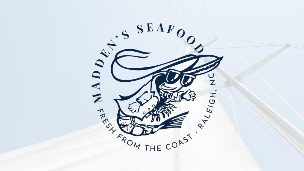
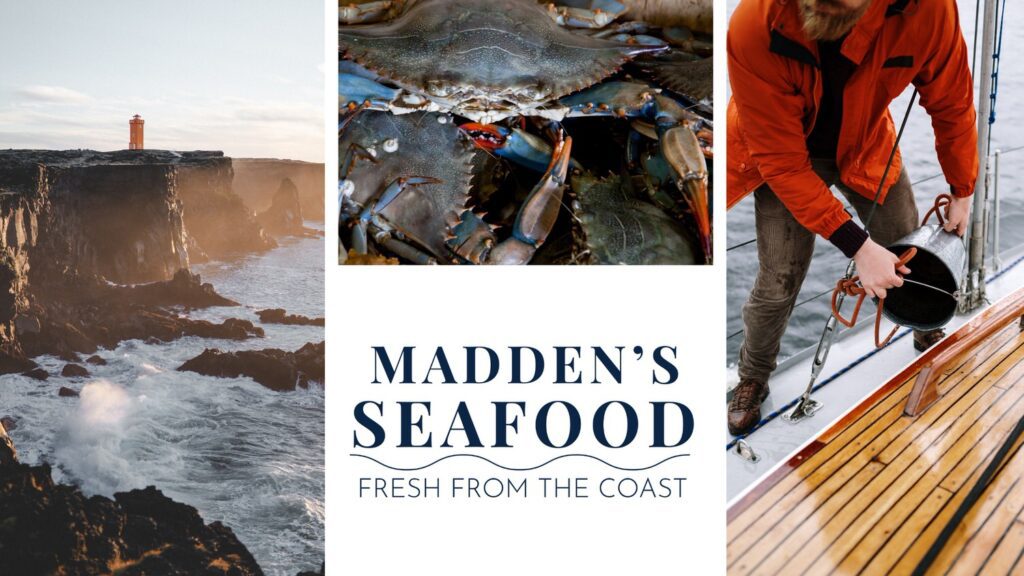
The business
Madden’s Seafood is a local seafood market in Raleigh, North Carolina that is dedicated to providing fresh, locally caught seafood.
The mission
Madden’s Seafood’s mission is to provide the best and freshest seafood possible to Raleigh. They aim to not only give you a delicious piece of seafood for the perfect meal but also to be completely transparent about where your seafood is coming from.
The promise
Madden’s Seafood aims to be your go-to local connection for the highest quality and freshest seafood around. They aren’t just here to sell you seafood, but to build a connection with you and chat with you just like a neighbor!
How we brought the brand to life
For the brand, we wanted to create a natural, light, and bright presence that reminds people of the coast. We used blues and corals to add a coastal feel with a sandy tan color to balance out the palette.
To keep with the nautical theme of the brand, we used a serif font with plenty of space between the letters to make the logo feel light. We also used wavy lines throughout some of the logos to represent the sea.
Whether you have a local restaurant or are selling products online or in stores, effective and strategic branding for food businesses is crucial. Not only will it elevate your brand and make it feel more professional, but it will also help you stand out from your competition and attract your dream customers. Still need that perfect, strategic brand for your food business? Click here to get in touch and see how we can bring your brand to life!