
In the world of finance, trust and credibility are paramount, making the significance of professional branding in financial services a necessity. Your brand is much more than a logo and how your brand as a whole is perceived plays a big role in the success of your business.
In the sea of the finance industry, there are so many businesses that people are turning to and looking to for advice. When it comes to your business, not only do you want it to stand out from the crowd, but you also want to make sure that when people see you, they see a brand that they can trust and a brand that they are confident in.
They see what makes you different from other financial advisors and financial coaches, establishing your own USP in the finance world.
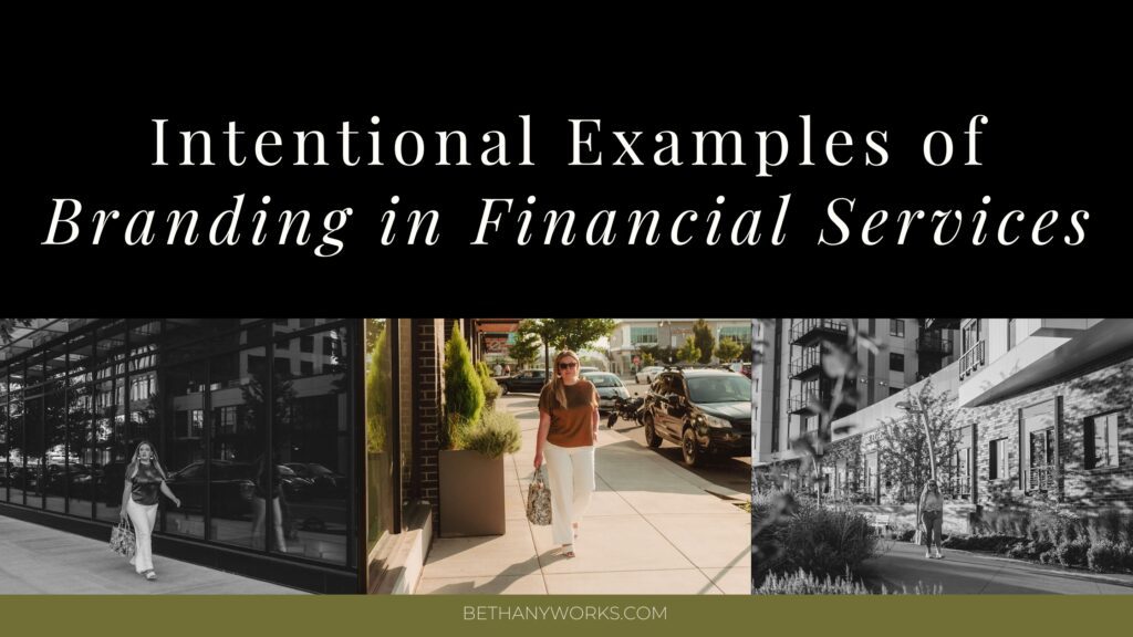
Let’s take a deeper look at why strategic branding is key in this industry as well as a few examples of branding in financial services and financial coach branding, including how they were built to attract each individual business’s ideal clients.
Why Financial Services Branding is so Important
Before we jump into some examples of strategic branding in financial services, let’s talk about why professional branding is so important in the first place. In any business, you want people to trust and respect you, but it is even more vital in the financial industry.
This is an industry where you are asking people to trust you with their money or trust your suggestions for how to plan out their financial future and you want to make sure there is no doubt when people come across your brand.
Now, when we talk about professional branding, this isn’t just your logo. It goes much deeper than that which is why it is vital that you don’t just get a brand, but you get an entire brand strategy.
A brand strategy will help you with aspects of your brand like defining your ideal client, having distinct brand messaging you know how to use, as well as the visuals of your brand that will draw people in.
Finding your ideal client is key to building up a client base of people who trust and respect your expertise as a financial advisor, planner, or coach. For example, if your business is geared towards helping young adults in their 20s set themselves up for success, your ideal client and brand strategy is going to be very different than if your business focuses on adults in their 40s and 50s getting ready for retirement.
Your brand strategy will also dictate your brand messaging. Are you going to be more formal and serious with your messaging? Are you looking to make financial decisions easier to understand and more laid back with casual language?
And, of course, part of your brand strategy is also going to be the visuals of your brand. This includes visuals such as your primary logo, any alternate logos or brand marks, brand patterns, font system, colors, and more!
Regardless of your ideal clients and your brand’s vibe, one thing to remember is that it does not have to be boring or plain just because that is what the financial industry is “traditionally” used to. Do something that is going to stand out and make your brand unique. (this means the Canva logo templates, Fivver generated designs, and website template that looks like every other financial coach/planner/advisor isn’t the answer).
Strategic Examples of Branding in Financial Services
KHB Financial

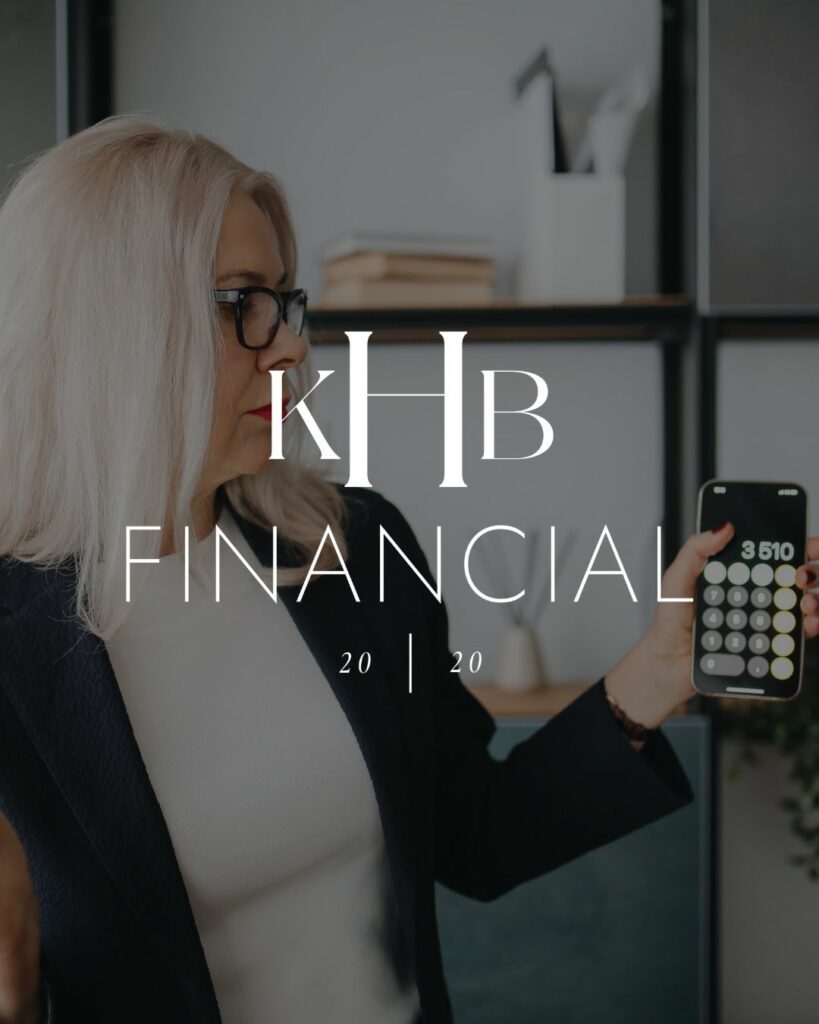
The business
Kim Hunter-Borst, founder of KHB Financial is a money coach who is skilled in maximizing opportunities in all situations and never hesitates when it comes to turning dream situations into reality.
KHB Financial works with high-income earring women who often work for fortune 500 companies and tend to be in their 40s or older.
The mission
KHB Financial was founded with the desire to show people that they don’t have to settle for less. They are driven by a core belief that it is never too late to take control of your finances.
The promise
When working with KHB Financial, you won’t just be told to take on more work, find side hustles, or stop doing things that you love. Instead, you’ll walk through their three-step framework to help you take control of your money and give yourself a raise.
How we brought the brand to life
When it came to Kim’s brand, we wanted to really focus on her ideal clients. They love the finer things in life and don’t want to see anything too bold or loud. They are more drawn to subtle and nuanced things so we leaned into that with the brand design.
We created a color palette that was subtle, yet still has some pops of colors. All of the colors create a luxurious and classic feeling that her ideal clients are drawn to.
When it came to her logos, we picked a very timeless serif font for her main “KHB” element paired with a thin sans serif font to create a sophisticated and upscale feel to the logos.
After working together, she was able to do things like land major speaking gigs within a few weeks of launching her brand, book new clients right away, and is now sought after by Fortune 500 to speak and coach.
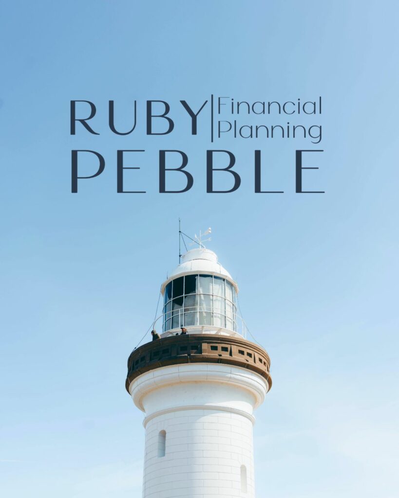
Ruby Pebble Financial Planning®
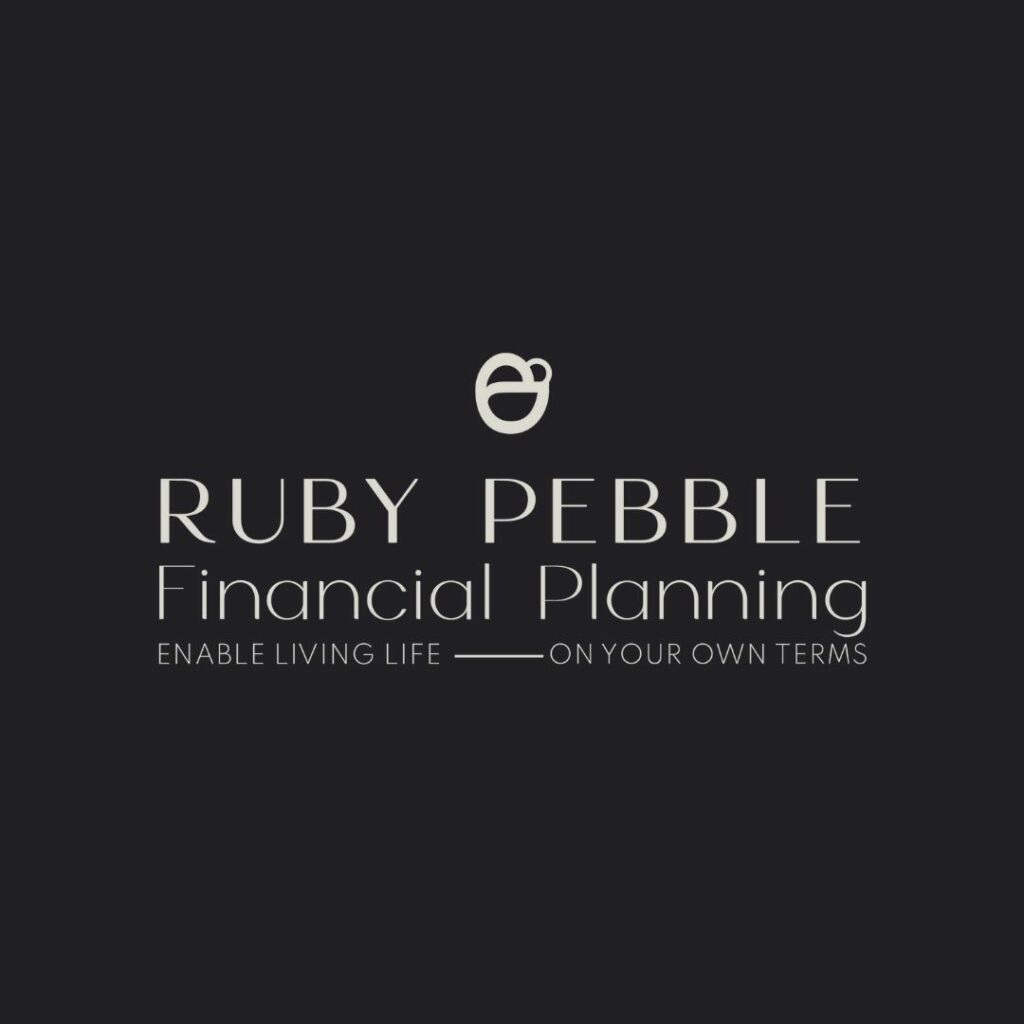
The business
Jamie, founder of Ruby Pebble Financial Planning®, helps clients create a tailor-made financial plan that accommodates your individual lifestyle – working with primarily non-traditional clients.

RESULTS THAT SPEAK FOR THEMSELVES
Download our case studies + client experiences to review the impact of our website design and brand strategy services have beyond the stunning deliverables you’ll find in our portfolio.
Their business is founded in the idea of inclusivity and being open to everyone including people who may keep their finances separate, are in a partnership but are unmarried, are LGBTQIA+, or are within the tech world.
The mission
The mission at Ruby Pebble Financial Planning® is to help break the mold and old-style way of thinking to create the life you had dreamed of with early retirement, lifestyle updates, and your own finances.
The promise
Based on direct, actionable steps, they will help walk you through a financial plan that once seemed stiff and unapproachable, but is actually achievable regardless of how non-traditional it may seem.
How we brought the brand to life
For Jamie’s brand, we wanted to create something that felt approachable while also giving off the sense of freedom that they create with all of their clients.
For her color palette, we used a bit more of a muted color palette. The blues throughout the palette are used to symbolize trust and wisdom. The deep ruby color is used to create a sense of passion in the colors.
For the logo suite, we used a sleek sans serif font to create a polished feel and one of expertise. We also used a combination of uppercase and lowercase text to create balance while making “financial planning” more inclusive and accessible.
Finally, we created an icon consisting of three pebbles that fit perfectly together. This represents cohesion and all of the pieces fitting together in harmony (while also making a slight reference to Jamie’s favorite sport, curling).
After working together, they were able to get on page one of Google for their exact clientele, and they are thriving in business. This was all because of the investment they put into their brand.
This isn’t something that will just “happen” or something you can cut corners on. It takes an investment to see that return of your ideal clients flooding in!
Family Money Adventure
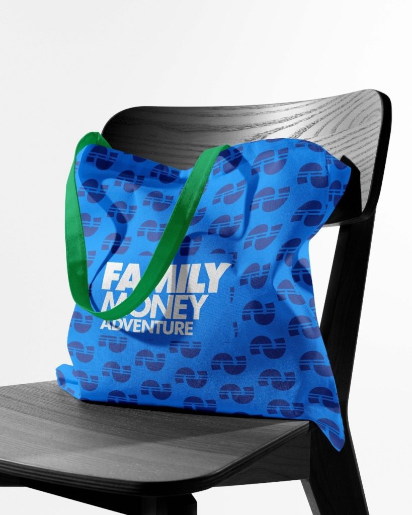
The business
Family Money Adventure, founded and owned by Kevin (a money nerd and financial writer), is a business committed to helping its clients create financial stability and security for their families in a way that feels right for them.
The mission
Their mission is to help you learn more about money and create the financial freedom that you are craving. They understand how important family and adventure are to you and aim to help create more flexibility and opportunities for that in your life with content created specifically for families, parents, and dads.
The promise
Their promise is simple. To provide everyone with well-rounded financial education from the perspective of a family. They want to help foster curiosity and hope in all of the people they work with to create a community of people who are reaching their highest potential.
How we brought the brand to life
When it came to creating their brand, we wanted to build something that was vibrant and fun. We built a color palette that has plenty of vibrant and bright colors that are grounded with a few more neutral colors.
For their primary logo, we created a hierarchy with “family”, “money”, and “adventure” with family being at the top and the largest to emphasize the importance of family.
When it came to creating the icon, we wanted to create something that felt unique, fun, and very family-oriented. We created an icon that resembled the curves you would find on a roller coaster or water slide that Kevin and his family enjoy together. This also represents the flows and ups and downs of money.
The lines through the middle symbolize the path moving forward as well as giving a subtle nod to the traditional symbol for money.
Final Thoughts on Branding for Financial Planners
Although you may initially think that all financial branding needs to be stiff and traditional, there is so much more you can do with your brand while still being backed by sound strategy.
If you are looking for financial planner branding that is built specifically for your ideal clients, let’s chat! You can click here to check out my custom branding packages that are backed by strategy or head over here to get in touch! (And yes, if you want to be sure your website links out to compliance documents, we make sure that happens too!)