Client: Family Money Adventure
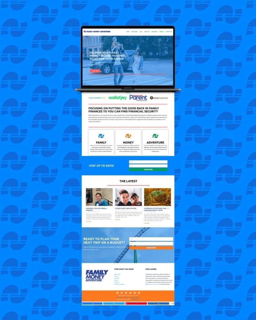
Kevin, founder and owner of Family Money Adventure is a long-time client of mine who came to me years ago for a website refresh. More recently, Kevin came to me ready to invest in custom branding and brand strategy so he could build a brand with a plan. Below is a peek at his brand project.
The Promise:
FMA promises to lead with empathy and optimism while providing well-rounded family financial perspective education. By doing this, they can build an audience that is cohesive and full of individuals reaching for their potential. They foster curiosity, consideration, and hope.
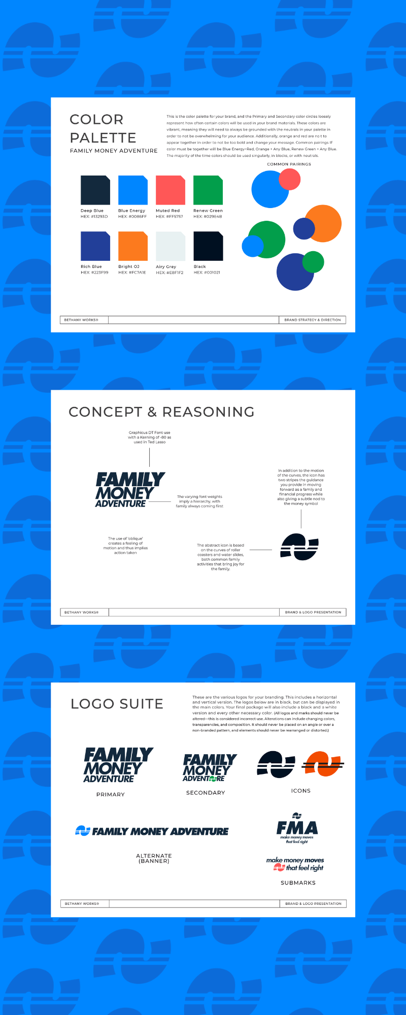
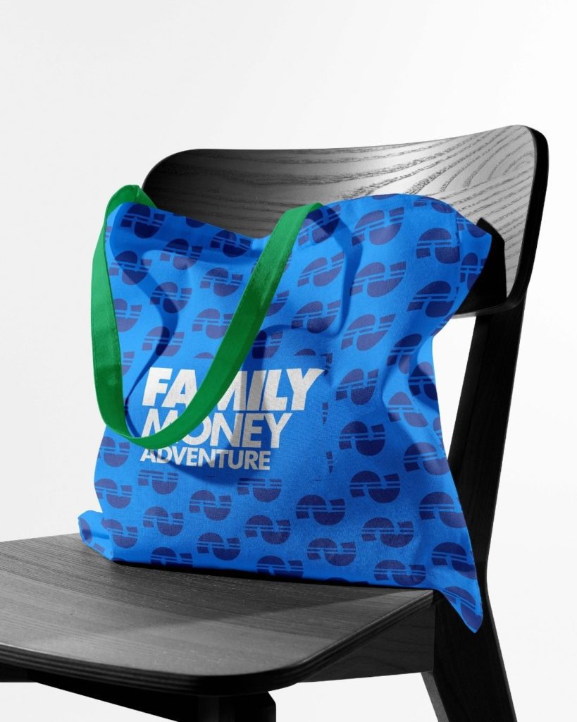
The icon for Family Money Adventure is one that was a bit of a roller coaster to come up with.😉 In the personal finance space the symbols for money have been overused to the point of exhaustion. In order to make sure FMA had a stand-out and unique brand icon, we went through several iterations. All along knowing that the symbol would be abstract. It needed to encompass the following ideas:
- Flow
- Action
- Movement
- Money
- Fun/Adventure
The roller coaster and water slide (both activities the founder and his family enjoy) became the basis for the icon. With a subtle nod to this and the money symbol on its side, the icon was born.