Your website is one of the most powerful marketing tools that you have for your business and can help bring your business to the next level if it is done correctly. But, what makes a good website design?
As a brand and website designer, I work every day to help create strategic brands and websites for business owners who are looking to take a step up. This includes working one-on-one with them to make sure their website is set up in a way that is going to work for their brand, not against it.
So, if you are asking yourself “What makes a good website design,” here are key elements that you want to pay attention to.
Key Elements That Make for a Good Website Design
Accessibility
Accessibility is going to be key for any business when it comes to its website design. In today’s online space, your website needs to be accessible for anyone visiting it. Now, when it comes to accessibility, this covers a few different aspects of the site.
The first elements you want to consider are your fonts and colors. While you may think that you just want to pick these based on what you like or what you think will work for your business, there is more to it when it comes to your website. Not only do you want to choose colors that back your brand mission (through color psychology), but you also want to make sure the palette has contrast.
Contrast between colors that you are using together needs to be distinct enough to actually see and read the different elements. For example, you wouldn’t want to put white text on top of a light yellow background because you can’t read it.
If you are not sure what is accessible on your site, there are also online tools that you can use to check the contrast of your colors and make sure they are able to be differentiated.
When it comes to your fonts, there are a few aspects you want to pay attention to. First, is that the font is actually legible. Especially when it comes to script fonts, they can often be hard to read and shouldn’t be used for main headers and body text. Instead you want a font system that works with your brand visuals and is easy to read
You also want to make sure the font size is large enough on your site. In general, you don’t want any fonts on your site to be under 14pt. Any smaller than this and you can potentially compromise the legibility of the text, this is especially true on mobile.
This site for Honey & Comb is a great example of using contrast in the colors and a script font as an accent that stands out and is legible.
The Combination of Website Speed and Design
We all know that speed is definitely important when it comes to your site. You can even think about your own online habits. Odds are you are more likely to exit out of a site if it is taking a long time to load.
So, while speed is important, you also want to make sure that you are not sacrificing the functionality or design of the site. You can create a beautiful site with all of the eye catching elements that you want without sacrificing your website speed.
It is, however, important to understand the website platform you are using before designing your site. Some design elements are going to be easier to create and “lighter” on some platforms than others.
In addition, you also want to consider how much code you are adding to your website (as this has the potential to slow down your site) as well as how many plugins you are adding. Especially on platforms like WordPress, it can be easy to want to add a bunch of plugins from the endless library to choose from. However, adding too many plugins, while it may seem like it is elevating your website’s design, can slow down your site and negatively affect the user experience.
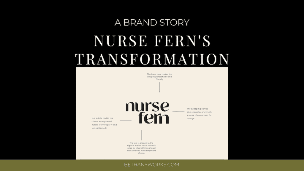
Good Branding

Now, while we are talking about websites, you can’t talk about effective website design without talking about branding. You can take the same website and only change the branding and you will see a major difference and improvement on the site with strategic branding.
When it comes to good branding, what we mean here is a brand that is rooted in strategy. Your brand should attract your ideal clients through each individual piece of it. This includes your logos, colors, fonts, messaging, and your brand voice.
Having a strategic brand is just the first step. You have to make sure that you are actually using your brand correctly and effectively on your website (check out what that can look like here). A brand guide can really help guide you (or your designer) in using your brand as it was designed to be used.
For example, you want to make sure that you are using the colors correctly and leaning on the primary colors of your brand for things like backgrounds and the secondary colors for things like highlights. You also want to make sure you are using your fonts correctly so you are creating text hierarchy on your site.
Your branding truly sets the foundation for how your website will look. It’s the reason I don’t ever do ‘only website design’…because what are you really using to inform the look of the site if it’s not a strategic brand design.
Intuitive Navigation
Your website should be extremely easy and intuitive to navigate for your website visitors. There are two main factors that go into this.
Easy and Intuitive Buttons + Menu
First, you want to make sure that you have buttons throughout your site that allow your visitors to easily navigate from page to page. This can mean potentially having a sticky header navigation so that they can always access additional pages.
If you don’t have a sticky nav bar, you want to make sure you have links to the other pages of your site in your footer so that users don’t need to scroll all the way back to the top of the page to go to another page.
Clear Calls to Action
You also want to make sure that your users actually know what the page leads them to. This means using titles for your buttons and navigation that are clear and what visitors are used to seeing.

RESULTS THAT SPEAK FOR THEMSELVES
Download our case studies + client experiences to review the impact of our website design and brand strategy services have beyond the stunning deliverables you’ll find in our portfolio.
For example, when it comes to your blog, people are going to expect to see the word “blog” in your navigation. They may not intuitively know that “journal” or “diary” actually leads to a blog.
For example, on the site for FED by Alex, we made the navigation very simple and to the point while also adding plenty of buttons throughout the pages that lead to that week’s menu.
Clear User Journey and Website Goal
Along with an intuitive navigation, it is also important that you have a clear user journey and website goal for your business. Let’s break this down a bit.
For most service based business owners, your website’s goal is going to be to get users to fill out your contact form, reach out to you, or book your services. In order to do this, everything on your site should lead people in the direction of your contact page. Only secondarily are you leading them to resources or a freebie…that’s for those who just aren’t quite ready to work with you yet. So don’t get caught up in ‘all the things’ on your site. The journey from first click to contact is the most important. Make this simple and intuitive.
A great way to do this is to make sure that every page ends with a call to action that directs people to your contact page. The only exception to this would be on your contact page itself, since they made it to the destination you wanted them to.
Movement

Finally, movement is also a great way to add more visual interest to your website design and keep people scrolling on your website. This doesn’t have to be any over-the-top or overwhelming movement. That can actually do the opposite.
Simple elements like video backgrounds (like we did for this client), scrolling text marquees, sliding galleries, GIFs, or even animations as you scroll down the page can be very simple and subtle, but make all the difference in your design.
The key here is going to be balance. Everything on your site should not be moving as this is going to make it confusing for your visitor and they won’t know where to look or what to pay attention to.
A good rule of thumb is that as you are looking at your own site, scroll through each page and think about where you would want to see a bit of movement to keep your own interest on the page. Normally, this will work out to every couple of sections on your page.
The Importance of Picking the Right Website Platform
If we are thinking about the question “what makes a good website design,” it is also important that you not only think about the elements above, but also the actual platform that you are building your website on.
Picking the right website platform for your business is key and there are so many different options out there to actually choose from. If you are not sure, what platform is best for your business, there are so many resources and online quizzes that you can look at to help point you in the right direction.
A few of the more popular options for website platforms are WordPress, Showit, Squarespace, and Shopify. While each of them have similar features, some of them are going to work better for different industries.
For example, if you have a larger e-commerce website, Shopify is a great option for you. However, if you have a smaller shop and maybe also offer services along with your products, Squarespace or WordPress are great options. For creatives and other entrepreneurs, Showit may be the best option and give you tons of flexibility in the design.
There is no one-size-fits-all website platform, but it is important that you take the time to pick the platform that is going to work best for your business. If you work with us, we can always consult with you on your options to make this decision.
Final Thoughts on What Makes a Good Website Design
Hopefully these tips will help you as you work to create a website that not only looks great, but also functions well for you and your business. If done correctly, your website can be your most effective marketing tool!
If you are ready to take the next step and build the website of your dreams, let’s chat. You can take a look at my brand and web design services here or you can head over here to get in touch and start building your strategic website.
Check out these posts next: