Choosing colors is truly one of the most fun parts when it comes to design work. If you’ve ever built a mood board for a brand of your own you’ll know that some colors just catch your eye. We’re all drawn to specific colors because of what they evoke in us (also known as color psychology), but other shades… not so much. Here are a few colors some designers love, and others love to hate – and, even more interestingly, the science behind them.
Unearth your brand personality to stand out. Take the FREE Brand Archetype Quiz!
Chartreuse
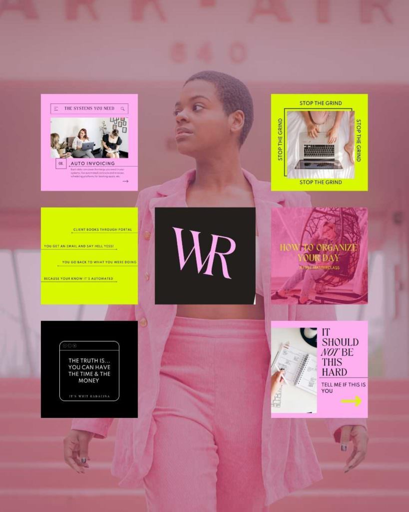
This bold color verges on neon, occupying the strange little space between yellow and green. It communicates boldness, innovation, vitality, and creativity. “Those are great traits!” you might be thinking. I agree – these qualities are great for most businesses, but some designers opt for less polarizing shades that communicate those same values.
The boldness of chartreuse can be jarring to some, and neon just doesn’t fit every brand. For me, this is a case-by-case situation, because when it works, it works. A fun pop of neon is the perfect addition to brands that need to be expressive and bold (maybe even a bit of a rebel)! If you do add neon colors to your palette, use them wisely as they can be polarizing colors in marketing.
Olive
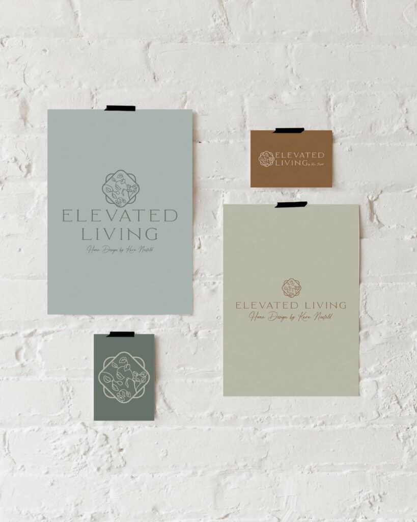
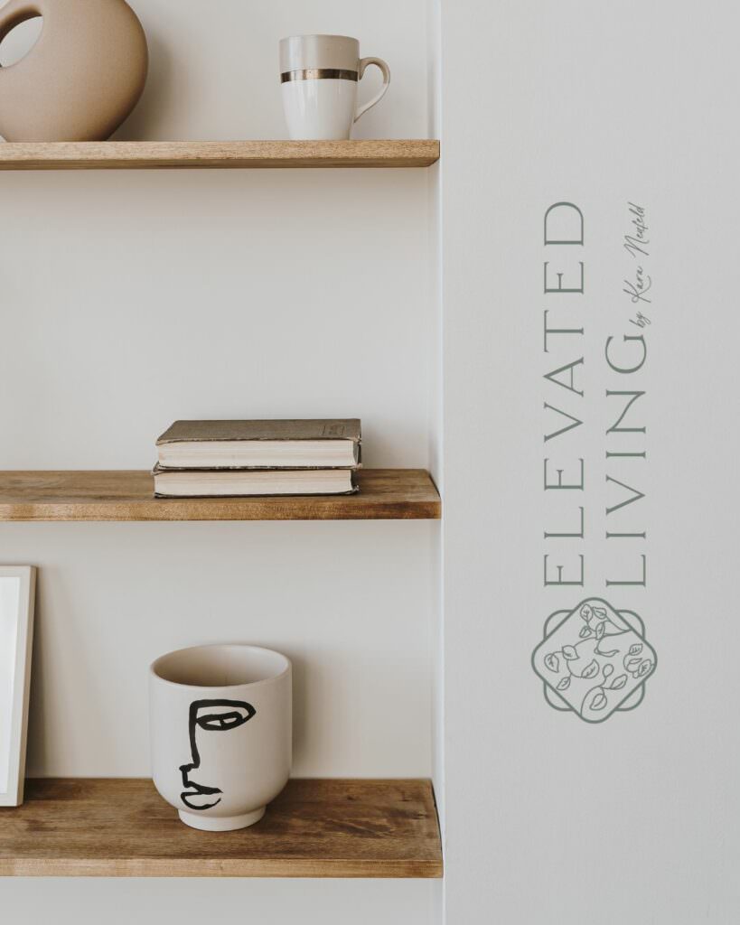
Did you know that olive isn’t actually a shade of green? Let me blow your mind here – this color is a combination of yellow and black, and it results in a peaceful, serene feeling for most viewers. In the wrong places, olive can feel dated, but designers are crafting its resurgence. This tone feels very grounded, and it creates the perfect backdrop for restful, caring brands.
Violet
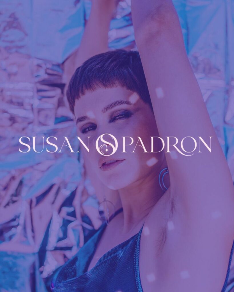
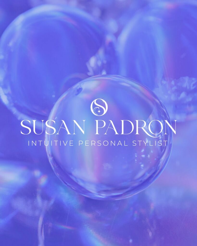
If you want a shade that always brings the party, let the search end with violet. This sweet spot between royal purple and magenta is the shortest wavelength of color that’s visible to the human eye. Don’t let its stature fool you – this color brings off-the-charts energy. Violet is dynamic, dramatic, and perfect for making a statement. It’s perfect for brands who aren’t afraid to get loud when it comes to color.
Ocher
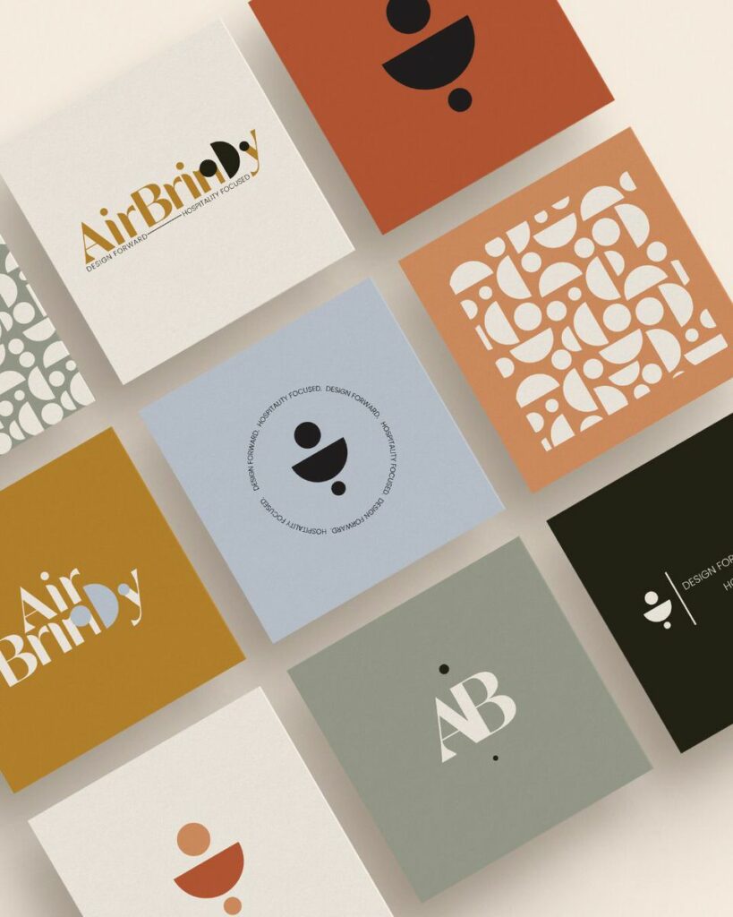
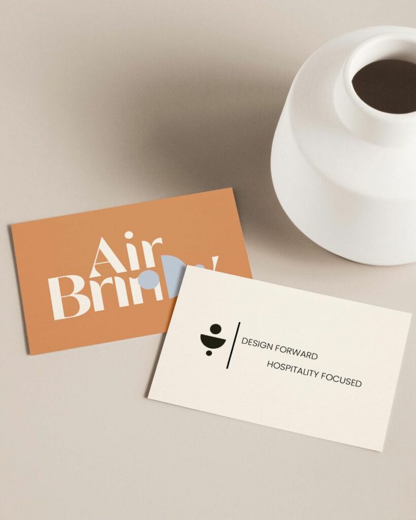
This natural shade is straight from the earth. It doesn’t fit neatly into the categories of yellow or brown, because some things from nature just can’t be replicated. Some call it sienna, butterscotch, or harvest gold, but its truest color can be found in clay and iron oxides. Combine the glow of the sun and the dust of the earth, and you’re holding ocher in your hands. This shade is energetic and strong, just like the sun, so you’ll see designers using it to elevate brands inspired by natural, earthy tones.
Coral
Nestled between true pink and peach, this transitional shade emanates from the tropics. Pure pinks can sometimes feel juvenile, but coral separates itself from the crowd, providing a gentle, warm, and friendly touch. Coral’s soft without being underwhelming, and it’s packed with positivity, making it the perfect fit for uplifting, feminine branding.
Mint

If you want your brand to communicate growth and life, you might see mint on your designer’s mood board. This color is a chameleon – its cool undertones help it to shift from fresh to clinical, depending on the selected shade and tint. Mint’s delicacy makes it the ideal base for a variety of brands, from youthful businesses to established medical practices. Sometimes, you’ll see it in tangible elements of a brand (like wall paint colors or business cards) rather than virtual ones, because this beauty doesn’t always read perfectly through the screen. Nevertheless, it’s a design favorite.
Colors are powerful! If you’re a fan of one of these polarizing shades, don’t worry. Experienced designers can help you fit your favorite tones into your brand identity – or steer you toward equally beautiful options that will evoke exactly what you hope your brand will provide. I would love to chat with you about how I can help.