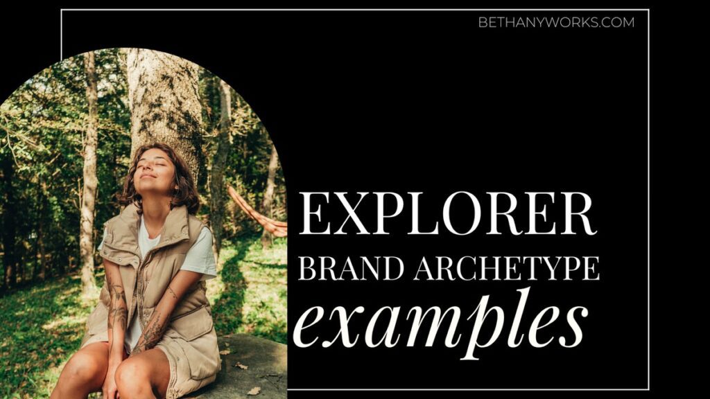
The explorer archetype is an archetype rooted in freedom, adventure, and exploration. Explorer brand archetype examples can be found in every industry and are not just reserved for travel or outdoor adventure brands.
Rather, the explorer refers to the feeling that each brand strives to create with its customers or clients. They want to empower you to break the mold and live your life how you want to whether that is giving you the right gear to go explore nature, setting you up with the tools to have financial freedom, or anything in between.
Let’s take a deeper look at what it is and some explorer brand archetype examples from past clients and major businesses.
What is the Explorer Brand Archetype?
Before we jump in and look at some explorer brand archetype examples, let’s talk about what the archetype is exactly. The explorer is one of 12 different archetypes that help brands express themselves (through their messaging and visual representation) in a way that is meaningful and connects to their ideal clients.
When it comes to the explorer, they are brands that are based on freedom, independence, and, exploration. Their goal is to live a full life of adventure and encourage others to break the mold and live the life they have always wanted to.
Explorers want everyone they interact with to feel alive and invigorated and are always open to exploring new things, whether that is new places or new ideas!
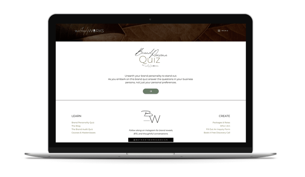
Unearth your brand personality to stand out. Take the FREE Brand Archetype Quiz!
What does an explorer brand look like?
So, what do these brands look like? Explorer brands tend to have a few common elements that make them easy to spot. When you think of exploration and adventure, your mind probably goes right to the outdoors and nature.
That is exactly what most (not all) explorer brands draw from. Most of the time, these brands have color palettes that are rooted in earth tones like greens and browns or colors like blues and yellows to evoke the feelings of nature like water and sunlight. They don’t tend to have bright or bold colors that aren’t found in nature.
The language used throughout the brand also draws on this adventurous theme and is usually based on themes like self-sufficiency, adventure, open-mindedness, and bravery with freedom always being at the root.
Some of the most popular explorer brand archetype examples are companies like REI, North Face, Patagonia, Jeep, and Timberland. All of these brands have colors rooted in nature and the majority of the language they use throughout their brand is rooted in travel and adventure.
Explorer Brand Archetype Examples
Lauren Still Living
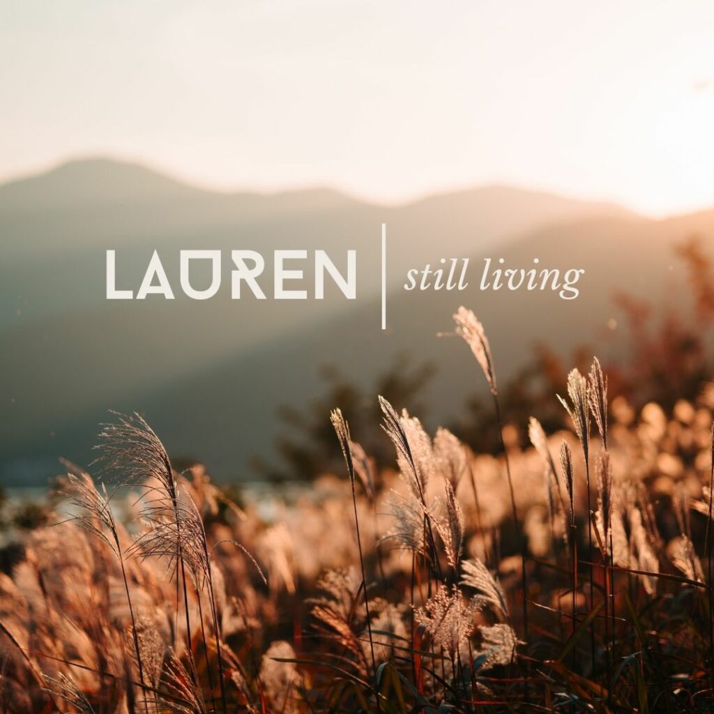
Lauren Still Living is a personal brand that we created for my amazing and inspiring client Lauren. Since being diagnosed with MS, Lauren made it her goal to check off some incredible outdoor adventures from her bucket list.
We designed a brand and website for Lauren to chronicle her adventures and journeys as she hikes across two of the highest mountain peaks in the United States with only a backpack.
When it came to the design for her brand and website, we leaned into the explorer archetype through her logos, color palette, and imagery. For her mark suite icon, we drew from classic park signs and shapes to create the tree and shield border.
Her color palette is rooted in more natural and muted colors like burnt orange, forest brown, and a darker green with a brighter yellow for contrast. We also used imagery throughout the site that represented the adventure she was embarking on and had more muted colors that you can find throughout nature.
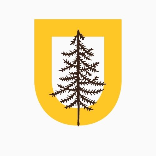
REI
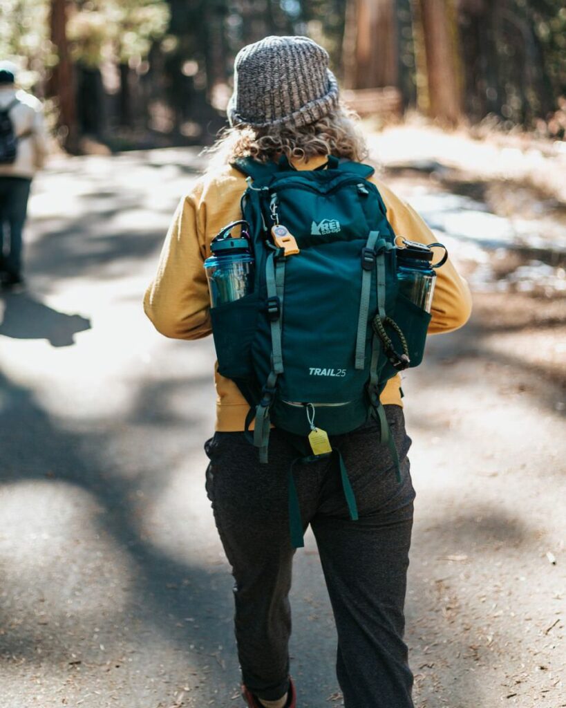
REI is a great example of the explorer brand archetype. Their colors are based on a natural color palette and are reminiscent of the colors you would find out on a hike or while kayaking on a lake. They even have a mountain right in their main logo.
They also do a great job of appealing to the explorer personalities through their language and visual content. REI embodies this to their core even on massively profitable days like Black Friday where they opt instead to close their doors and encourage everyone including their employees to #optoutside instead of shopping and contributing to mindless consumerism.
Their marketing and social media content is based on being active and always looking for the next adventure. Whether that is exploring your own backyard or traveling across the world, they make you feel empowered to take on anything.
Miranda Marquit
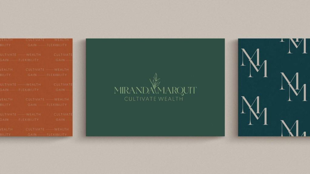
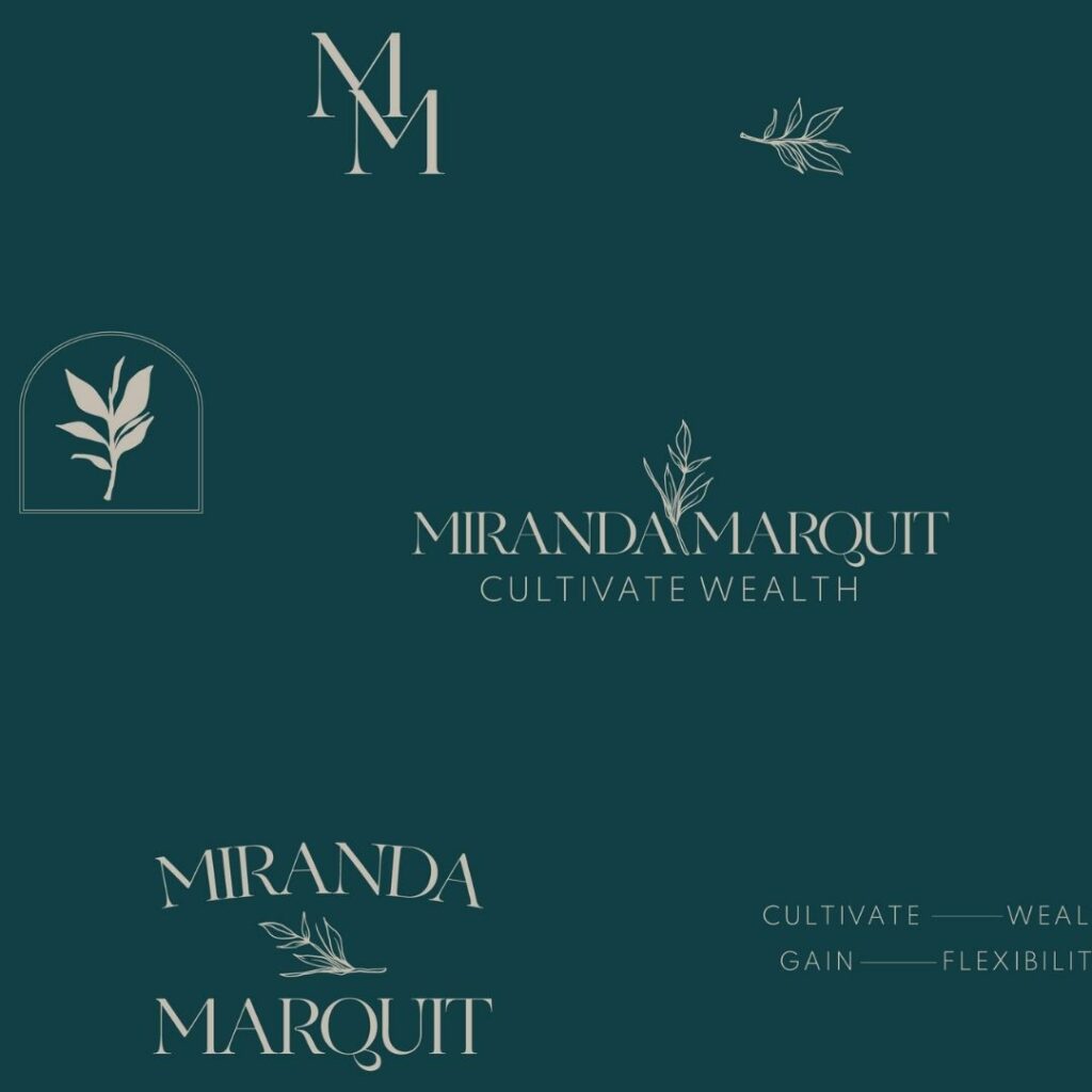
Miranda Marquit is a perfect example that explorer brands are not just for outdoor companies or travel bloggers. Miranda Marquit is a speaker, writer, and podcaster who helps others make the most of their life and money. She works with them to find ways to cultivate wealth and build freedom in their life.
While the name Miranda Marquit may not scream explorer archetype, we made sure the rest of the brand represented the archetype well. Her color palette consists of mostly greens and blues. We used these to symbolize wealth but also self-awareness and growth.
For her mark suite, we incorporated a small leaf into her logos and icon to bring in another element of nature and again the idea of growth to the brand. Finally, we used the tagline “Cultivate wealth. Gain flexibility.” and key words like “independent”, “exploration”, “journey”, and “open” to infuse more of the explorer archetype into the language throughout the brand.
Jeep
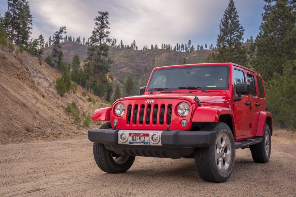
When you think of Jeep, you probably think of off-roading, camping, and adventure. Jeep has done an amazing job over the years of branding themselves as a rugged, off-the-grid car for those who are always looking for the next new thing to explore.

RESULTS THAT SPEAK FOR THEMSELVES
Download our case studies + client experiences to review the impact of our website design and brand strategy services have beyond the stunning deliverables you’ll find in our portfolio.
A big reason for their success as an explorer brand is because of the language they use and they way they visually represent their brand. For example, one of their slogans is “Legends aren’t born, they’re made.” They use language like this to draw in customers who want to step out of the ordinary and be free in their own lives to get behind the wheel and go wherever life takes them.
The visuals they use throughout their brand also draw on this same adventurous spirit. Commercials tend to show people off-roading, camping, or even towing things like boats, RVs, and more. Each time they represent their brand in the media, they are targeting those free-spirited individuals who are going to see a Jeep and not just want it because it is a nice car but want it because of the lifestyle that is associated with it.
Green Content Co

Green Content Co creates SEO-optimized blog and website content for cannabis and other plant medicine companies. They aim to provide sound and researched content that is trustworthy and authoritative (that part of their brand is actually the expert archetype- but we balanced this with their client who is likely the explorer when not behind a desk)
When it came to creating their brand and website, we wanted to lean into the explorer archetype with their mark suite and colors to ensure that first connection caught their ideal clients eye. Not only did we use a small botanical element in the logo and icons, but we also used arches and curves in the logos to elevate the organic and natural feel. We stayed away from direct cannibas leaves in order to stand out from competitors and hone in high end brands.
The color palette we chose has rich earth colors with a balance between desert hues and forest greens. We used more natural and subtle reds and oranges to create a warm and welcoming feeling and greens to establish trust and imply growth.
Patagonia
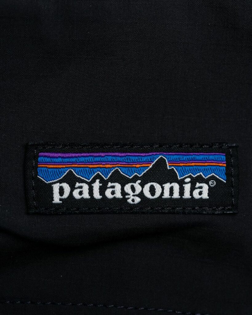
Patagonia is one of the most well-known outdoor adventure brands. Not only are their products geared towards outdoor lovers, but they are also eco-conscious in everything they do.
Similar to brands like REI and North Face, Patagonia uses a lot of adventure-focused language throughout their brand to help further express their values. However, they also tend to put more emphasis on conservation with the various campaigns and organizations they work with.
This not only symbolizes the ideals of the explorer archetype but also helps set them apart from similar brands while also targeting a more specific customer base that aligns with their values.
When it comes to their visual representation, you immediately see the explorer idea in their logos with the mountains in the background.
Their brand colors are one way they stand out from their peers in this category as they lean on colors that occur in nature at rare moments- like sunsets, sunrise, etc- which makes them more stark, bright, and colorful than other brands. This is tied to their belief in catching moments while also being hyper-aware of the way you live your life and surroundings.
Final Thoughts
Explorer brand archetype examples can be found in every industry and it is represented in various ways throughout a business’s brand. Some brands are going to lean more heavily on the visual representation through their colors and logos while others are going to focus more on the language they use throughout their branding- because most brands have two archetypes with one being dominant
Regardless of how this archetype is expressed, you are sure to be able to see the freedom and adventure infused throughout.
Interested in learning if your brand fits the explorer archetype? Take the brand persona quiz or get in touch to see how we can bring your brand archetype to life!