Selecting the perfect color palette is one of my favorite things about strategic design. Of course, you want to choose colors you like when it comes to your brand – but it actually goes so much deeper than that.
Colors evoke things in us, bringing specific emotions to the surface, sometimes without us even noticing it consciously. What color mean strength? What color evokes positive energy? Brand voice and content is important, of course, but don’t neglect this aesthetic piece of the puzzle.
Choosing the right colors can give your brand a boost before you ever say a word.
This is why strategic design always employs color psychology when building brands and design elements. I’ve seen it for myself – the right color can change a mood, relay nonverbal messages, and even influence a purchasing decision! When you work with me, we’ll find out exactly who you are, what kind of brand you want to build, and what kind of customer you want to sell to – and I’ll build a brand that caters to that specific vibe.
Not sure how to define your brand yet? Take my archetype quiz to get started.
Unearth your brand personality to stand out. Take the FREE Brand Archetype Quiz!
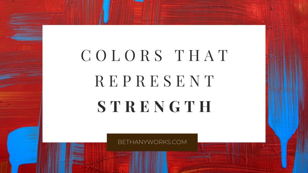
Some businesses want to bring up soft, soothing emotions, but today, we’re focusing on businesses that emphasize strength. The first type of strength is the obvious kind – The Ruler and The Hero archetypes probably know what I’m talking about here.
Brands like this are all about showing courage, determination, and power, as well as inspiring others to find those same qualities within themselves. A tell-tale sign of brands with these values? A pop of red.
RED: High Energy and Strength
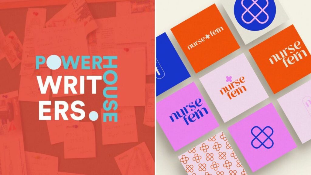
Red, like most warm colors, has an invigorating and exciting visual effect and is one of the top colors that represent strength. It oozes with high energy and vitality, bringing to mind primal elements like fire and blood.
It’s the hallmark shade of strong emotion and is one of the first to come to mind when you think about a color that represents strength – so much so that when someone’s angry, we say they’re “seeing red.” But anger isn’t the only thing represented by this bold tone – passion, courage, and love are also attributed to red shades.
Your audience will be inspired by your hard work and commitment to being the best at what you do, and they’ll stick with you in hopes that they can be their best as they follow your lead.
COOL DEEP BLUES: DEPENDABLE POWER
Bold strength is admirable, but quiet strength is just as effective, and this calmer, dependable kind of power is often showcased by cool blues. Cool shades tend to settle us down, offering us a relaxing visual that encourages us to breathe.
It evokes a sense of safety and stillness that archetypes like The Caregiver and The Sage represent beautifully.
Brands that strive to represent their strength through their trustworthiness and reliability should opt for blue colors that symbolize strength instead of bright red tones. Your audience will draw strength from your stability, and if they feel safe with you, they’ll follow you anywhere.
STRENGTH AS A CORNERSTONE
If strength is a cornerstone of your brand, which camp are you in? Are you a bold, high-energy kind of strength that inspires others, or do you draw people in with your quiet reliability and dependable nature?
There’s plenty of room for both to thrive, and there are strategic design choices that can show off your brand persona while highlighting the colors that mean strength – so pick colors that feel right to you, and watch the right customers come knocking at your door.