
Looking at successful branding examples can spark inspiration and reveal what connects with different audiences. But effective branding goes far beyond a pretty logo or a color palette. It’s the entire strategic foundation that makes customers instantly recognize your business and feel compelled to choose you over competitors.
The most unbreakable brands master every touchpoint, from visual elements to brand voice and deeper psychological triggers. Let’s unpack what makes these brands so memorable and how you can apply their strategies to your business.
What Is Branding Design?
“Branding design” is the visual and strategic framework that defines how your business appears and feels to the world. Branding doesn’t stop at logos and colors, although they are important.
Strong brand identity design weaves together multiple layers, such as your brand story, mission, brand values, visual identity, and the emotions you want to evoke in your target audience.
When developing your brand strategy, focus on:
- Brand positioning and unique value proposition
- Target audience research
- Brand voice and messaging guidelines
- Visual identity (logo, colors, fonts, imagery style)
- Core values
- Customer experience
- Brand application guidelines across all platforms
In other words, there are multiple brand elements that must come together for your brand to become unbreakable, in addition to the visual assets.

Want to be seen in your best light?
Get The Works—my email list that acts as a ring light for your brand.
Let’s turn the spotlight on you.
Why Your Brand Identity Matters
Strong visual branding creates an immediate connection. In fact, color boosts your brand recognition by up to 80%, leaving a lasting impression. But visual impact alone won’t sustain long-term success.
Your brand’s deeper strategy—how you position yourself, communicate, and deliver experiences—determines whether customers develop genuine trust and loyalty.
Since 81% of consumers need to trust a brand to consider buying from it, building that trust through consistent, authentic branding becomes essential for converting prospects into customers.
The most powerful brands speak to consumers on a subconscious level, tapping into their emotions, desires, and motivations that drive purchasing decisions.
15 Psychology-Backed Branding Examples
1. Zestiny Wealth


When Ally launched Zestiny Wealth, she faced a common challenge in the financial services industry: standing out in a crowded market. She wanted to position money as a tool for empowerment and share the investing education that most people never received in school. The challenge was creating a brand that felt approachable and authentic but still professional enough for financial services.
We developed a comprehensive brand strategy that reflected Ally’s vision of making financial planning feel exciting. The visual identity and messaging strategy emphasized her “zesty” approach to wealth building. Ally launched successfully with immediate traction, including increased web traffic, qualified leads, and improved search visibility in her target markets.
2. Georgia Conservancy


Georgia Conservancy approached us after years of piecemeal branding efforts managed by various volunteers and supporters. They needed a cohesive visual identity, clear messaging strategy, and a more robust digital platform to support their expanding stewardship programs and advocacy work.
We developed a psychology-backed brand strategy that unified their message around protecting Georgia’s natural resources for current and future generations. The rebrand included a complete visual identity system, brand strategy guide, and SEO-optimized copywriting that communicated their role in conservation education and community partnerships.
3. Golden Hour Esthetics


Licensed esthetician Lurlyn Hasselblad founded Golden Hour Esthetics as a sanctuary where self-care meets professional expertise. Her vision was to create a space that welcomes clients of all ages and genders with the belief that everyone deserves healthy, glowing skin. Lurlyn needed a brand that reflected her inclusive, down-to-earth, and expert approach.
We crafted a complete brand identity that feels authentic, warm, and uplifting, perfectly capturing the “golden hour” concept. Working with our trusted copywriter, we developed SEO-optimized content and built her website on Showit. See more med spa branding.
4. Nurse Fern


Emma came to us with a scattered Nurse Fern blog that lacked cohesion. She had valuable content but no unified brand strategy to tie everything together, and her goal was to turn her blog into a legitimate business that would stand out and help nurses find remote work opportunities.
We created a vibrant brand identity that expressed Emma’s energetic personality and boosted her professional credibility. The brand is bright and attention-grabbing without being overwhelming, reflecting her rebellious-with-purpose approach.
As a result of the rebrand, Nurse Fern’s monthly website traffic jumped from 15,000 to 94,000 sessions, her email list grew from 2,000 to 42,000 subscribers, Instagram followers increased from 10,000 to 71,800, and TikTok grew from 60,000 to 134,100. Most importantly, Emma successfully went full-time with her business!
5. Southwest Wanderlust

RESULTS THAT SPEAK FOR THEMSELVES
Download our case studies + client experiences to review the impact our website design and brand strategy services have beyond the stunning deliverables you’ll find in our portfolio.


Brindy needed to create a direct booking site for her vacation rental properties, and Southwest Wanderlust required the perfect blend of nostalgic Southwest charm and modern mid-century style that her properties embodied.
We developed a visual system inspired by the organic textures found throughout her properties, such as natural stone, artisan tiles, and warm wood elements. The design required two comprehensive icon sets: property markers for guest capacity, bathrooms, bedrooms, and house types, plus amenity icons for guest information. Brindy secured three bookings immediately after launch!
6. Revival Beauty Tools


Noel launched her beauty brand Revival Beauty Tools with a mission to create luxurious beauty tools that elevate both appearance and spirit. Her initial product launch struggled to gain traction, reaching only $4,000 in sales, so she needed a brand and online platform that would effectively communicate her brand promise and help her reach her goals.
Revival Beauty Tools’ brand identity positioned it as a premium beauty brand focused on both inner and outer transformation and generated an immediate impact. Noel’s relaunch generated over $14,000 in sales and completely sold out her inventory!
7. Bellflower Therapy


Ranann Bell, a Licensed Professional Counselor and Horticultural Therapist, wanted to break away from traditional office-based counseling. She specializes in outdoor therapy, guiding clients through emotional challenges while walking in nature. She needed a brand that would communicate this unique approach and attract clients seeking healing beyond four walls.
We conducted market and SEO research before developing her strategy, making data-driven decisions about her brand assets and marketing materials. We also helped her create the name “Bellflower,” a Pacific Northwest wildflower symbolizing gratitude and support, which captures her therapeutic philosophy and connects to her last name, Bell.
8. The New York Stylist


Liz’s outdated brand no longer reflected her classic, timeless style. She needed a complete branding transformation to feel inspired again and start attracting the right clients.
Bethany Works® created a beautiful brand identity for The New York Stylist, capturing Liz’s elegance. The results were almost immediate with increased traffic, more bookings, and brand deal opportunities. The momentum continued, and we developed automated email funnels that added 2,000 subscribers and launched a style quiz that brought in over 50,000 subscribers. Her email list now maintains a 69% average open rate, making it one of her most valuable business assets.
9. Ruby Pebble Financial Planning


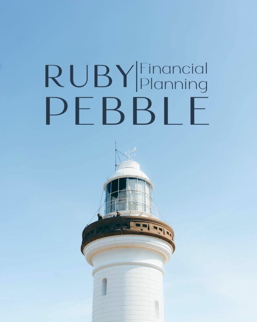
Jamie (they/them) identified a gap in financial planning: the industry’s neglect of non-traditional clients and lack of personalized, tech-supported solutions. They wanted to offer inclusive, education-focused services for early retirement seekers and couples with separate finances, and needed a brand that’d position them as leaders in that niche for their target customers.
We created a memorable brand strategy reflecting Ruby Pebble’s commitment to inclusivity and innovation. As a result, Jamie launched their business full-time and now ranks on the first page of Google for “LGBTQ financial planner” and “Seattle LGBTQ financial planner.” In their first year, they generated 105 leads, held 65 intro meetings, signed 23+ clients (5 as retainers), and built a waiting list.
10. Slade Copy House


Haley, one of the most playful brands in our portfolio, needed a complete brand overhaul for Slade Copy House that reflected her vibrant personality and psychology-backed copywriting expertise. She wanted professional credibility without losing her bubbly, authentic energy.
She doubted that was even possible, but Bethany Works® created a colorful brand identity and website that spoke directly to Haley’s potential customers and built a personal connection. After her launch, Haley quadrupled her income to consistent $15,000+ monthly revenue, and grew from 100 to 254,000 impressions in 16 months. She also expanded into an agency model, hiring a team.
11. Path to Bliss Wellness
Path to Bliss Wellness is a therapy practice that guides clients with empathy, intention, and truth, giving them the tools to create lasting change in their lives.
This practice needed their branding to communicate safety, acceptance, and holistic healing, so we created their identity using warm yet professional colors. Path to Bliss Wellness now attracts aligned clients in their local area (thanks to our SEO work!) who value their philosophy and approach.
12. Susan Padron


Susan Padron is known for her intuitive abilities as a personal stylist, believing that the inner self should align with outer expression. She needed a rebrand to improve her marketing efforts and align them with her fashion-forward, soulful approach.
Bethany Works® designed Susan’s brand identity with lots of creative flavors, capturing her approach to personal styling. She now attracts high-caliber aligned clients primarily through Google SEO with an average of 4,000 monthly views. Susan gained recognition from major publications including InStyle, Well & Good, Forbes, and Real Simple, and successfully launched a top 10% ranked podcast.
13. Donchez Law Firm


Founded in 1987, Donchez Law Firm is built on the brand values of family, integrity, and justice in personal injury law. As a family-run firm, they needed a brand that would reflect their personal approach & genuine care, setting them apart from corporate law firms.
We developed an in-depth brand redesign and WordPress website and worked with our copywriter to make sure everything was SEO-optimized. The new brand positioning emphasizes the firm’s role as steadfast allies who guide clients with compassion and clear communication.
14. Cascade Dome


Cascade Dome is an off-grid glamping experience in Cascade, Idaho. They needed a brand that captured digital detox and nature connection, appealing to couples seeking luxurious outdoor retreats off the beaten path and increasing brand loyalty.
Bethany Works® fused rugged adventure with refined comfort, and the visual system features clean, geometric elements echoing the dome’s structure with natural, earthy tones reflecting the Idaho mountains. Cascade Dome is now a premier destination for couples seeking reconnection in nature.
15. Adventure Amore


Founded by Adam Amit, Adventure Amore specializes in elopement photography that captures untamed, profound devotion against Colorado’s natural landscapes. He needed a brand that positioned Adventure Amore as a promise of joy, connection, and celebration tailored to couples’ adventurous dreams.
We developed a vibrant brand identity featuring bold, earthy colors and clean typography that reflects both adventure and romance. As a result of his launch, Adam and his team started attracting more aligned clients coming to Colorado to elope from across the country.
16. Koomi


Derin Kumi created KOOMI™ as a luxury lifestyle blog to help women who are looking for more than just the surface level wellness trends and the ever changing luxury hype. She wanted to create a brand that not only honored the roots of where each person comes from, but also embrace beauty and the finer things in life.
We aimed to create a brand that not only felt luxurious, but also honored her own African heritage. The comb icon and the style of the two ‘o’s specially (as a symbol of the cowrie shells) were used as a nod to her culture. We also used deep, rich colors to give the brand that high end feel without feeling trendy or like it is going to go out of style.
17. Path to Bliss Wellness


Based in Portland, OR, Path to Bliss Wellness uses a holistic therapy approach to help their clients understand, process, and move forward in their life with confidence. The founder, Chelsea Ward, came to us without an actual brand, but knew that this was the next step to better connecting with clients.
For their brand, we focused on creating a color palette that is very calm and inviting. We wanted the brand as a whole to speak to the peace that clients can hope to find and create a space that feels safe and inviting.
18. Somana Release


Amanda Saunders, founder of Somana Release, has 20+ years of experience in massage therapy and movement healing, but her brand wasn’t showing off that expertise and the transformation that can happen with a true mind-body connection.
With this as the focus of her new brand, we wanted to bring both a sense of whole body connection and growth to every part of the design. We tied in astrological aspects to the florals in the logos with the moon cycles being featured in the icons.
The colors are rooted in deep jewel tones that represent the intensity of the work that is being done and growth that is fostered through this practice.
19. Bedside dropout Nurse


Payton Babb, aka the Bedside Dropout Nurse, wanted to create a brand that she could use to not only highlight her freelance writing work and expertise, but also her community for other nurses looking for alternatives. We wanted to create something that felt professional and put together, but also showed off the joy and happiness that can come from finding the career path that truly lights you up.
One of my favorite parts of the brand is the parachute icon we created. With her tagline of “soft landings for bold nurses” this was such a fun way to incorporate that as a visual that stands out in the nursing space. We also create a color palette that not only has soft, calm tones, but is also playful highlighting that there is joy to be found in the field regardless of where you end up.
20. Kristin Vincent


Kristin Vincent is a guide for women in their 40s, 50s, and beyond who are ready to break free from their careers and routines that they have been stuck in and create something wildly different. Her whole brand is centered on breaking the mold and stepping into who you have been waiting to become.
With a business that is rooted in breaking the mold and making bold choices, we aimed to create a brand that felt just as bold and creative. Her color palette has unexpected pops that stand out and call attention to them. For her logos, we chose a font that isn’t expected and is totally unique in how the letters are designed to emphasize the free and electric feeling found in stepping into your new self.
Looking for more branding examples? Visit our Portfolio!
Unearth Your Brand® with Bethany Works®
At Bethany Works®, we specialize in psychology-backed brand strategies for fierce visionaries and tenacious creatives on a mission to elevate their brand. Our branding process uncovers your unique positioning to express your brand in a way that actually means something to your audience.
If you’re ready to stop leaving money and impact on the table and craft a unique identity like the branding examples above, learn more about our design services or get in touch!